App design prompts 는 화면을 예쁜 이미지가 아니라 product system 으로 설명할 때 유용합니다. user job, hierarchy, device frame, components, state, review rule 을 먼저 정하세요.
TL;DR: 스타일보다 앱 brief 먼저
- 먼저 화면 역할을 정합니다: onboarding, dashboard, editor, checkout, marketing mockup 등.
- navigation, primary panel, controls, cards, table, chart, empty state, CTA, safe areas 를 적습니다.
- product identity 나 UI hierarchy 를 유지해야 할 때만 reference image 를 사용합니다.
- final copy, accessibility, component logic, production code 는 생성 이미지 밖에서 처리합니다.
- Vogue AI 에서는 같은 skeleton 을 유지하고 실패 위험에 따라 GPT Image 2, Nano Banana, Midjourney 를 선택합니다.
복사 가능한 prompts
영어 블록을 복사하고 대괄호 variables 만 바꾼 뒤 첫 생성에서는 구조를 유지하세요.
- Mobile onboarding app screen: Realistic iOS app design for [app category], one clear welcome headline area, three benefit cards, thumb-safe primary CTA, bottom progress dots, clean product hierarchy, soft neutral background, 9:16 aspect ratio, readable generic labels only, no fake brand logo, no distorted text.
- SaaS dashboard app design: High-resolution desktop web app screen for [product category], left sidebar navigation, top filter bar, primary KPI cards, one chart panel, one data table, visible empty or loading state, realistic SaaS spacing, 16:9 browser frame, readable generic labels, no brand logos, no watermark.
- Marketplace product-detail screen: Modern mobile app screen for [marketplace niche], large product media area, compact seller card, price and trust signals, sticky bottom CTA, clean card hierarchy, realistic ecommerce UI density, 9:16 aspect ratio, no exact legal copy, no distorted text.
- AI productivity editor: Desktop app design for [workflow], split layout with input panel, preview canvas, right settings drawer, status chips, version history, restrained professional UI, 16:9 aspect ratio, readable generic labels, no decorative filler.
- App store presentation mockup: Premium marketing image for [app name], two realistic device frames showing key screens, visible interface hierarchy, soft reflection control, clean desk context, 16:9 aspect ratio, screen remains readable, no fake logo, no watermark.
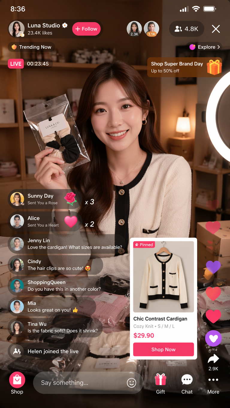
예시: fashion livestream dashboard
결과가 poster 처럼 보이면 screen job 과 component inventory 를 강화하세요. text 가 깨지면 generic labels 를 쓰고 final copy 는 나중에 추가하세요.
FAQ
이 prompts 는 Figma 나 code 를 대체하지 않습니다. concept visuals, hierarchy exploration, presentation mockups 에 적합합니다.
Vogue AI 모델 선택
- GPT Image 2 는 hierarchy control 에 적합합니다.
- Nano Banana 는 fast variants 에 적합합니다.
- Midjourney 는 stylized presentation 에 적합합니다.
- 같은 prompt skeleton 을 유지하세요.
구조 체크리스트
- Screen job 이 명확합니다.
- Layout regions 가 있습니다.
- Component inventory 가 있습니다.
- Text policy 가 있습니다.
- Review rule 이 있습니다.
| 실패 | 수정 |
|---|---|
| 너무 장식적임 | Screen job 을 추가합니다. |
| Text 깨짐 | Generic labels 를 사용합니다. |
| 용도 | Model |
|---|---|
| 엄격한 hierarchy | GPT Image 2 |
| 빠른 variants | Nano Banana |
| Stylized presentation | Midjourney |
App design prompts 란?
App screens, dashboards, mobile flows, product mockups 를 생성하기 위한 structured brief 입니다.
Figma 를 대체하나요?
아니요. Concept exploration 에는 유용하지만 final design 이나 code 를 대체하지 않습니다.
Reference 는 언제 쓰나요?
Layout, identity, UI hierarchy 를 유지해야 할 때 사용합니다.
Text 가 왜 깨지나요?
Image models 는 정확한 typography 에 약하므로 generic labels 를 사용하세요.
어떤 model 부터 쓰나요?
Control 은 GPT Image 2, variants 는 Nano Banana, style 은 Midjourney 를 먼저 시도하세요.
첫 결과는 어떻게 고치나요?
Hierarchy, text policy, style 순서로 수정하세요.