实用的 prompt engineering tips 不是抽象理论,而是把图片生成提示词写成可控制的制作 brief:主体、构图、参考图职责和第一轮修正规则都要清楚。
TL;DR:按可控制层写提示词
- 先确定任务:产品图、人像、海报、UI mockup 或概念探索。
- 先写主体再写风格,主体不清楚时再多形容词也会变成噪音。
- 尽早锁定裁切、镜头距离、留白、背景和比例。
- 参考图只用于保护身份、形状、包装、颜色或 UI 层级。
- 第一张图按失败类型诊断,每次只改一个控制点。
谁适合这套方法
这套方法适合需要稳定产出视觉素材的人,而不是只追求一次偶然好图。产品营销、创作者、设计师和社媒团队都可以把它当作可复用工作流。
- 适合产品主图、电商图、人像头像、广告概念、UI 展示和社媒封面。
- 当参考图需要保护人脸、产品形状、包装、品牌颜色或界面层级时尤其有用。
- 不要把提示词当最终设计稿,它更像第一轮可审查 brief。
实用公式
| 层级 | 写什么 | 为什么重要 |
|---|---|---|
| 任务 | 资产类型和发布渠道,例如产品页主图、头像、社媒海报或 UI 展示。 | 任务决定画幅、信息密度,以及是否需要给后期文字留白。 |
| 主体 | 具体产品、人物、界面、物体或场景。 | 主体清楚,模型才不会把错误对象“美化”得很好看。 |
| 层级 | 主角、辅助道具、背景,以及哪些元素要保持安静。 | 视觉层级能减少杂乱,让画面更容易被扫描。 |
| 风格 | 真实感、材质、色板、时代感、镜头情绪和光线。 | 风格要在主体和层级稳定之后再发挥作用。 |
| 参考图 | 上传图片要保护什么,以及哪些部分可以变化。 | 参考图职责不清时,最容易导致身份、包装或界面漂移。 |
| 输出规则 | 比例、不要文字、不要水印、透明背景、安全区或审核目标。 | 输出规则把提示词连接到真实发布场景。 |
场景矩阵
| 目标 | 提示词重点 | 参考图作用 | 先检查什么 |
|---|---|---|---|
| 产品主图 | 产品形状、材质、角度、光线、背景、阴影和电商裁切。 | 当包装、轮廓、logo 位置或颜色必须稳定时使用。 | 轮廓是否准确、材质是否真实、标签是否变形、留白是否足够。 |
| 人像头像 | 身份、表情、服装、背景分离、镜头和肤质。 | 当人脸、发型、姿势或年龄感需要连续时使用。 | 眼神、年龄感、皮肤质感、发型和多余肢体。 |
| 社媒海报 | 主体、渠道规格、负空间、品牌色和活动情绪。 | 可用于固定品牌色或延续上一轮 campaign 视觉。 | 焦点是否明确、标题区是否干净、是否生成了无效文字。 |
| UI 展示 | 界面层级、设备角度、桌面环境、反光和 SaaS 展示感。 | 当真实屏幕或产品结构需要接近原稿时使用。 | 界面是否可读、设备是否变形、反光是否干扰、裁切是否遮挡产品。 |
可复制提示词示例
下面的公开提示词块保持英文,方便在 Vogue AI 或其他工具中直接复制。关键不是堆词,而是保留可复用结构。
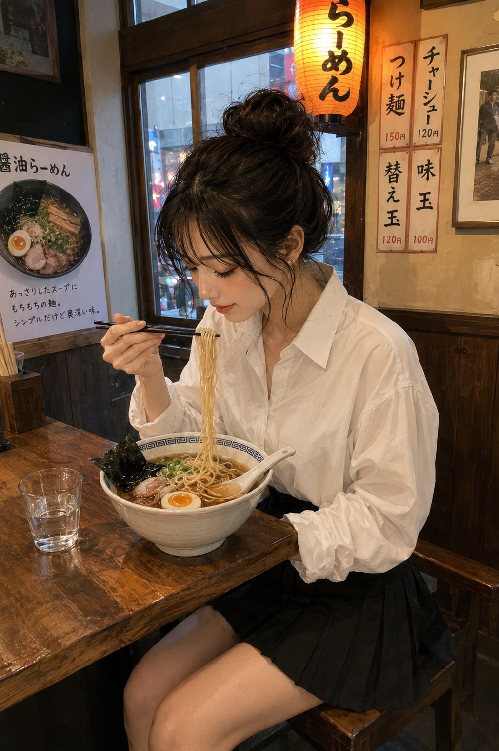
- Product hero: Ultra-realistic studio product photo of [product], centered on a clean [background color] stage, crisp material detail, softbox lighting from upper left, subtle grounded shadow, premium ecommerce composition, 4:5 aspect ratio, no text, no watermark.
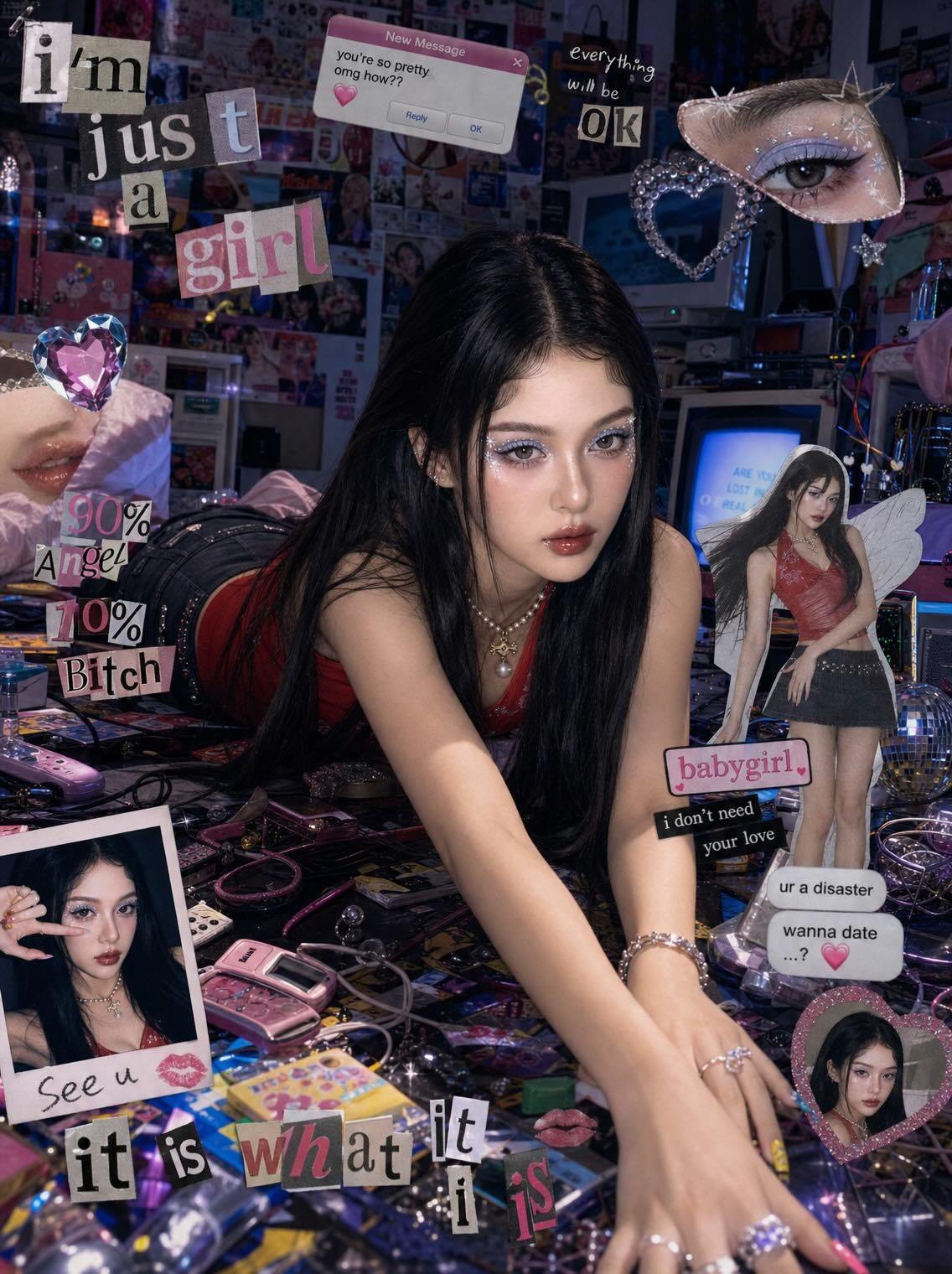
- Reference portrait: Use my uploaded image as the face reference. Preserve [face identity / hairstyle / expression], change the wardrobe to [style], clean editorial lighting, natural skin texture, sharp eyes, 3:4 crop, no extra hands, no text.
- Social campaign visual: High-impact campaign image for [topic], main subject [subject], bold negative space for a future headline, [brand color palette], cinematic rim light, modern fashion editorial framing, 9:16 vertical, no generated text.
- UI showcase: Premium product marketing image showing [app or website] on a modern device, readable interface hierarchy, clean desk surface, restrained reflections, soft ambient light, 16:9 aspect ratio, no fake buttons, no text overlays.
弱提示词改写示例
弱:Make a cool product photo for my headphones。强:写清耳机材质、角度、背景、光线、留白、4:5、no generated text。
两个可复用案例
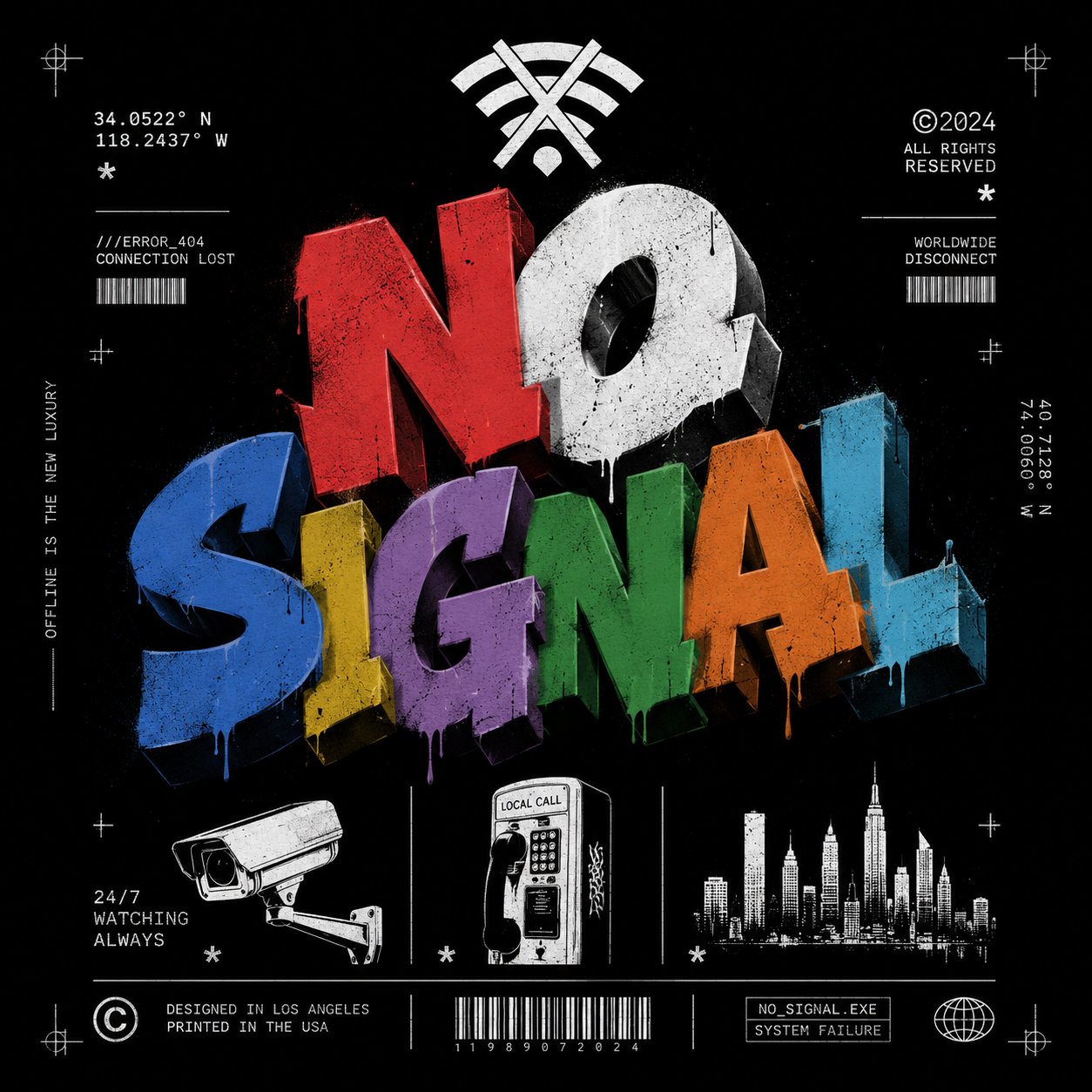
- 产品图案例:先检查材质、容器、阴影和裁切,再改氛围。
- 海报案例:先确认主体、留白和后续排版空间,再增加风格强度。
- 如果结果泛化,先补充材质、渠道和使用场景,不要直接整段重写。
Vogue AI 工作流
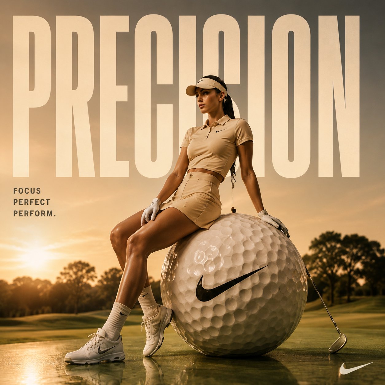
- 控制和参考一致性优先用 GPT Image 2。
- 快速变体和轻量 image-to-image 探索用 Nano Banana。
- 时尚氛围和风格概念探索用 Midjourney。
- 切换模型时保持同一提示词骨架,比较才有意义。
- 保存解决任务的版本,并标出可替换变量。
失败诊断表
| 失败类型 | 先修哪里 | 避免 |
|---|---|---|
| 主体或身份错误 | 加强主体描述,或明确参考图要保护的部分。 | 继续堆风格形容词。 |
| 风格太泛 | 补充受众、渠道、材质、光线和品牌色。 | 在 brief 没修好前整段重写。 |
| 构图混乱 | 指定比例、镜头距离、留白、背景和视觉焦点。 | 先换模型而不修布局。 |
| 文字或 logo 崩坏 | 去掉生成文字,预留后期排版区域。 | 要求模型直接生成最终可读文字。 |
| 好结果一改就漂 | 复制已成功版本,只替换一个变量。 | 把多个修改一次性叠上去。 |
第一张图之后先改什么
不要按“喜欢/不喜欢”评价第一张图,而是按任务失败点检查。主体错了先改主体,构图乱了先改裁切,风格泛了先补受众和发布渠道。
- 主体或身份错误:强化主体描述或参考图职责。
- 画面太泛:补充受众、渠道、材质、季节和品牌色。
- 构图混乱:优先改比例、镜头距离、留白和背景。
- 文字或 logo 错误:去掉生成文字,给后期排版留出空间。
FAQ
最重要的提示词技巧是什么?
先写清任务和主体,再写风格。清楚的 subject、composition 和 output rules 比一段漂亮但模糊的描述更容易优化。
越长越好吗?
不是。只有控制真实失败点的细节才有用。先补结构、参考图职责、比例和审核标准,再考虑增加风格描述。
什么时候用参考图?
当脸、产品形状、包装、UI、logo 位置或颜色系统必须稳定时。提示词里要说明参考图保护什么。
坏结果怎么修?
先命名失败类型,再只改一个控制点。主体错改主体,构图乱改 crop,风格泛改受众、材质和光线。
要生成最终文字吗?
通常不要。最终标题、价格、法务文案和 logo 更适合在设计工具里添加,生成阶段只保留干净留白。
好提示词怎么复用?
保存解决问题的版本,标出变量字段和参考图职责,然后复制给下一个任务。复用结构,不复用所有表面细节。