App design prompts は、画面を単なるきれいな矩形ではなく product system として書くと使いやすくなります。user job、hierarchy、device frame、components、state、review rule を先に決めます。
TL;DR:スタイルより先にアプリ brief を書く
- まず画面の役割を決めます:onboarding、dashboard、editor、checkout、marketing mockup など。
- navigation、primary panel、controls、cards、table、chart、empty state、CTA、safe areas を書きます。
- product identity や UI hierarchy を保つ必要がある時だけ reference image を使います。
- final copy、accessibility、component logic、production code は生成画像の外で扱います。
- Vogue AI では同じ skeleton を保ち、失敗リスクに合わせて GPT Image 2、Nano Banana、Midjourney を選びます。
コピー用 prompts
英語のブロックをコピーし、角括弧の variables だけを差し替え、初回生成では構造を固定します。
- Mobile onboarding app screen: Realistic iOS app design for [app category], one clear welcome headline area, three benefit cards, thumb-safe primary CTA, bottom progress dots, clean product hierarchy, soft neutral background, 9:16 aspect ratio, readable generic labels only, no fake brand logo, no distorted text.
- SaaS dashboard app design: High-resolution desktop web app screen for [product category], left sidebar navigation, top filter bar, primary KPI cards, one chart panel, one data table, visible empty or loading state, realistic SaaS spacing, 16:9 browser frame, readable generic labels, no brand logos, no watermark.
- Marketplace product-detail screen: Modern mobile app screen for [marketplace niche], large product media area, compact seller card, price and trust signals, sticky bottom CTA, clean card hierarchy, realistic ecommerce UI density, 9:16 aspect ratio, no exact legal copy, no distorted text.
- AI productivity editor: Desktop app design for [workflow], split layout with input panel, preview canvas, right settings drawer, status chips, version history, restrained professional UI, 16:9 aspect ratio, readable generic labels, no decorative filler.
- App store presentation mockup: Premium marketing image for [app name], two realistic device frames showing key screens, visible interface hierarchy, soft reflection control, clean desk context, 16:9 aspect ratio, screen remains readable, no fake logo, no watermark.
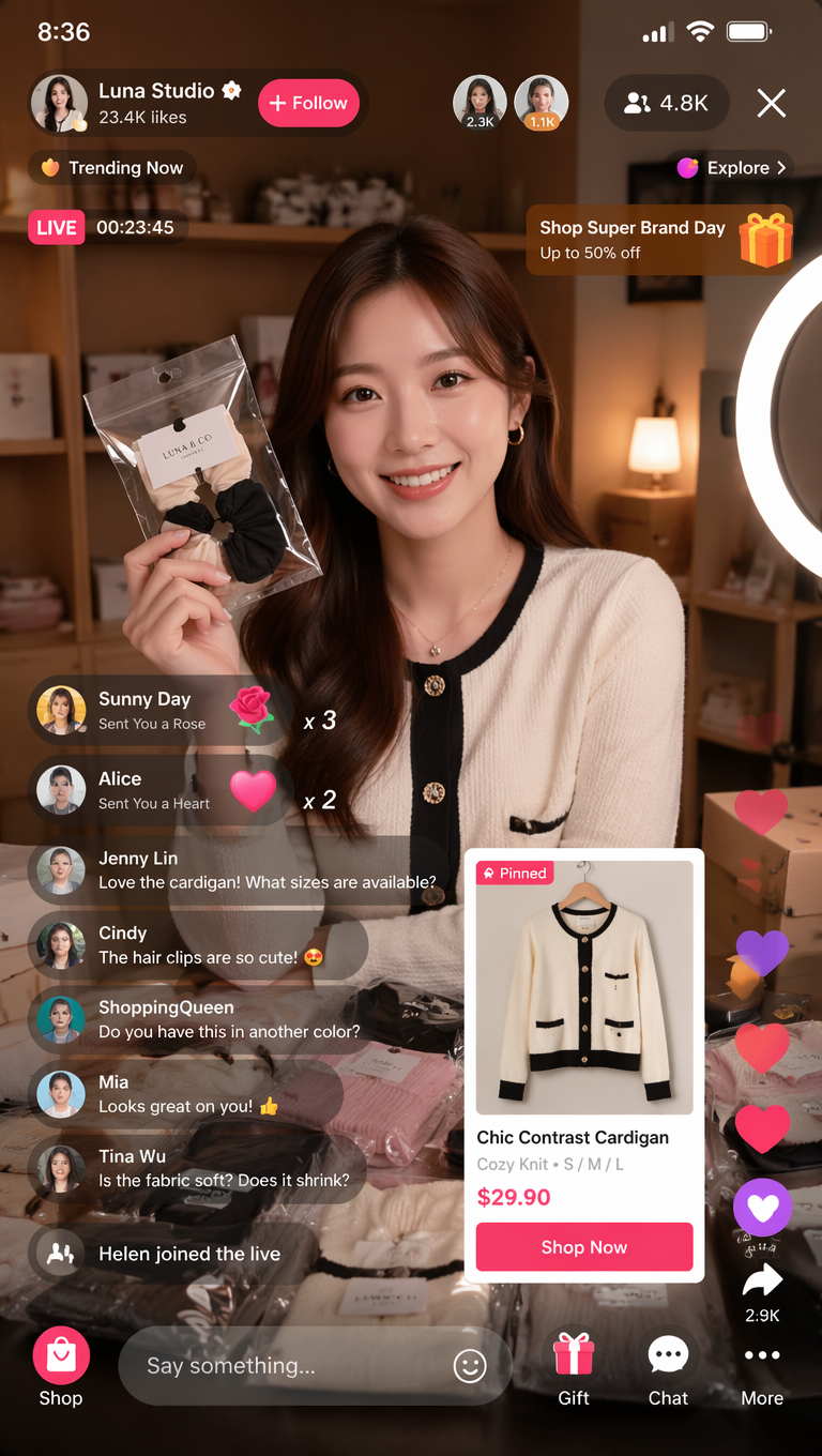
実例:fashion livestream dashboard
結果が poster に見える場合は screen job と component inventory を強めます。text が崩れる場合は generic labels にして、最終 copy は後で追加します。
FAQ
これらの prompts は Figma や code の代替ではありません。concept visuals、hierarchy exploration、presentation mockups のためのものです。
Vogue AI でのモデル選び
- GPT Image 2 は hierarchy control 向きです。
- Nano Banana は fast variants 向きです。
- Midjourney は stylized presentation 向きです。
- 同じ prompt skeleton を保ちます。
構造チェックリスト
- Screen job が明確。
- Layout regions がある。
- Component inventory がある。
- Text policy がある。
- Review rule がある。
| 失敗 | 修正 |
|---|---|
| 装飾的すぎる | Screen job を追加する。 |
| Text が崩れる | Generic labels を使う。 |
| 用途 | Model |
|---|---|
| 厳密な hierarchy | GPT Image 2 |
| 速い variants | Nano Banana |
| Stylized presentation | Midjourney |
App design prompts とは?
App screens、dashboards、mobile flows、product mockups を生成するための structured brief です。
Figma の代わりになりますか?
いいえ。概念探索には役立ちますが、最終 design や code の代替ではありません。
Reference はいつ使う?
Layout、identity、UI hierarchy を保つ必要がある時に使います。
Text が崩れる理由は?
Image models は正確な typography が苦手なので generic labels を使います。
どの model から試す?
Control は GPT Image 2、variants は Nano Banana、style は Midjourney から試します。
初回結果はどう直す?
Hierarchy、text policy、style の順に修正します。