良い infographic prompts は、形容詞の寄せ集めではなく制作 brief として機能します。強い prompt は、主体、構図、何を固定するか、そして初回生成後に何を確認するかを明確にします。
TL;DR:prompt を再利用できる制作 brief として書く
- まず subject、composition、style、output rule、channel goal を決めます。
- product visual、campaign layout、social poster、UI concept で同じ骨格を使い、変えるのは変数だけにします。
- 最初の結果は審美判断ではなく診断のために使います。
- identity、packaging、face、palette、UI hierarchy を守る必要があるときだけ reference image を加えます。
- 仕事を解いた version を保存し、次回は Vogue AI でそこから始めます。
この infographic prompts が解くべきこと
この検索意図はかなり実務的です。ユーザーが欲しいのは、コピーして少し変えれば制御しやすい first draft が出る prompt です。だから inspiration の列挙ではなく、structure の説明が必要です。
- 良い結果:recipe card、campaign layout、campaign visual、UI concept に使える first draft が出ること。
- 悪い結果:見た目は上手いのに、モデルが大事な部分を勝手に変えてしまうこと。
- 判断基準:その prompt は real brief を守れるか。
インフォグラフィックプロンプトの公式
| 要素 | 入れる内容 | 重要な理由 |
|---|---|---|
| Subject | 具体的な product、person、object、scene、screen。 | subject が曖昧だと他の指示も不安定になります。 |
| Context | product page、launch post、ad、gallery card、UI showcase のどこで使うか。 | channel によって framing と usable output の基準が変わります。 |
| Composition | angle、crop、distance、negative space、visual anchor。 | composition は最初の失敗を減らす最短ルートです。 |
| Style | material、realism、mood、palette、brand tone。 | style は subject control を壊さずに visual language を絞ります。 |
| Lighting | softbox、rim light、daylight、backlight、cinematic contrast。 | lighting が generic image と usable draft を分けることが多いです。 |
| Output rules | aspect ratio、no text、transparent background、safe area、no watermark。 | real job に合わせるために必要です。 |
| Reference handoff | reference image が何を固定するか。 | reference は役割が明確なときだけ有効です。 |
| Review check | 生成後に最初に確認する点。 | これがあると prompt 全体を書き直さずに済みます。 |
シナリオ別マトリクス
| 目的 | Prompt の焦点 | 固定するもの | 最初に直すもの |
|---|---|---|---|
| 商品ローンチ visual | hero subject、material detail、launch lighting、見出し用スペース。 | product silhouette、packaging cues、background hierarchy。 | まず crop と negative space。 |
| Portrait campaign image | expression、wardrobe、skin texture、camera distance、palette。 | brand hierarchy、hairstyle、eyes の sharpness。 | まず reference handoff。 |
| Social poster | focal point、contrast、channel ratio、future text space。 | subject hierarchy と text-safe area。 | まず clutter と headline space。 |
| UI concept | device framing、interface hierarchy、surface、reflections。 | screen structure と認識してほしい product area。 | まず perspective と reflection noise。 |
コピーできるインフォグラフィックプロンプト例
例を 1 つコピーし、角括弧の変数だけを入れ替えて、最初の生成では残りを固定します。Prompt blocks はどの言語でも English のまま残し、Vogue AI にそのまま貼れるようにしています。
- Minimal symbol infographic: A clean vector-style infographic mark for [brand name], combining [core object] and [brand attribute], simple geometric silhouette, strong negative space, one-color black on white, balanced proportions, no words, no mockup, no gradients.
- Comparison infographic: Side-by-side infographic comparing [option A] and [option B], 4 criteria rows, balanced columns, simple icons, clean grid, headline-safe top area, 4:5 aspect ratio, placeholder labels only, no watermark.
- Blueprint infographic: Elegant blueprint-style infographic for [object or concept], labeled zones, thin technical lines, numbered callouts, generous margins, editorial blue-and-cream palette, no dense paragraphs, no watermark.
- Data story infographic: Magazine-style data explainer about [topic], one hero statistic, three supporting panels, simple chart-like shapes, strong contrast, readable spacing, 16:9 aspect ratio, placeholder numbers only.
実際の画像と prompt を使った 2 つのケース
この手の記事は、抽象的な公式だけでは弱いです。以下の 2 ケースは Vogue AI prompt library の実例で、実際の画像、実際の prompt、そして再利用すべき構造をそのまま確認できます。
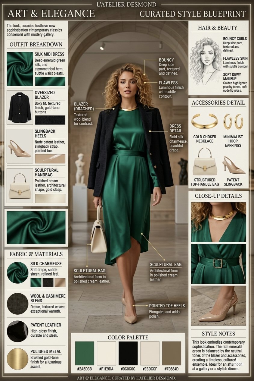
ケース 1:callout を制御する技術ブループリント構造
ここで真似すべきなのは特定の object ではなく、hero view、numbered callouts、generous margins、そして labels を短く保つ output rule です。
- Prompt:Technical blueprint infographic for [product or concept], orthographic hero view, labeled component zones, numbered callouts, thin technical lines, generous margins, cool blue-and-cream palette, placeholder labels only, no dense paragraphs, no watermark.
ケース 2:判断を整理するブランドシステムのインフォグラフィック
このケースは brand system を理解しやすく保つための構造です。promise、audience、palette、logo-safe area、service pillars を別々の zones に分けると、翻訳やデザイン調整もしやすくなります。
- Prompt:Professional branding infographic for [business], showing brand promise, audience, palette, logo-safe area, three service pillars, and channel examples, editorial grid, clean hierarchy, placeholder copy only, no final claims, no watermark.
完全な例:launch brief から最初の prompt へ
元の brief
5 ステップの onboarding process 用に launch infographic を作る必要があります。process explainer と lesson handout の両方で使いたく、ステップ順と短い labels は安定させたい。さらに上部には将来の headline 用スペースが必要です。
Prompt version 1
- Clean vertical onboarding infographic for a five-step onboarding process, five numbered sections from [STEP 1] to [STEP 5], one simple icon per step, consistent spacing, clear hierarchy, friendly SaaS education style, top area left open for a future headline, placeholder labels only, 4:5 aspect ratio, no dense paragraphs, no watermark.
初回生成後の修正
step order は正しいのに labels が詰まるなら、全部書き直さないでください。labels を短くし、spacing を増やし、five-section structure は固定します。layout は明確なのに icons が generic なら、icon style、palette、background treatment だけを調整します。
形容詞を足す前にやること
弱い prompt の多くは、言葉が足りないのではなく control が足りません。poetic wording より先に precision を入れてください。
- frame が散らかるなら crop、angle、negative space を追加。
- subject が揺れるなら subject sentence を締めるか reference を追加。
- style が generic なら audience、channel、palette を追加。
- text が壊れるなら prompt から text を外し、後で design tool で入れる。
Vogue AI 内での model 選び
Vogue AI では prompt skeleton をなるべく固定し、model choice は失敗リスクに合わせます。
- GPT Image 2 は instruction control と object fidelity が必要なときに向いています。
- Nano Banana は quick variation と軽い image-to-image に向いています。
- Midjourney は mood-heavy、editorial、stylized exploration に向いています。
- model を変えるときも同じ skeleton を使うと、何が result を変えたか追いやすくなります。
最初の生成後に何を変えるか
最初の生成は、prompt の文章ではなく real job と比べて評価します。改善は、一番大きい production failure を先に直すのが最速です。
| 問題 | 最初に直すこと | 避けること |
|---|---|---|
| product、face、screen の identity が違う | subject を強めるか、明示ルール付きの reference image を足す。 | identity が安定する前に mood adjectives を増やす。 |
| composition が弱い | crop、distance、angle、negative space を修正。 | frame を直す前に model を変える。 |
| style が generic | audience、palette、material、channel context を追加。 | prompt 全体の書き直し。 |
| text や infographic が壊れる | text generation を外し、空き領域を確保する。 | 最終 marketing copy を完璧に書かせる。 |
| 良い result が徐々に崩れる | best version を複製し、variables だけ置換。 | 不安定な prompt に edits を積み重ねる。 |
- identity 問題:まず subject boundary か reference handoff。
- layout 問題:次に ratio、crop、empty space。
- style 問題:frame が安定してから palette、lighting、audience。
- production 問題:text、legal copy、小さな UI details は後工程の design tool で。
FAQ
良いインフォグラフィックプロンプトとは何ですか?
subject、composition、style、output rule、review check が明確で、最初の結果を real brief と比較できる prompt です。
毎回長い prompt が必要ですか?
必ずしも必要ではありません。subject、frame、output を control できるだけの detail があれば十分です。装飾語はその後です。
reference image はいつ使うべきですか?
identity を守りたいときです。product shape、packaging、face、infographic placement、palette、UI hierarchy などが対象です。
Vogue AI ではどの model から試すべきですか?
失敗リスクで選びます。GPT Image 2 は control、Nano Banana は quick variation、Midjourney は stylized exploration に向いています。
なぜ generic な画像ばかり出るのですか?
多くの場合、audience、channel、palette、composition rule が足りません。generic output は vague brief から生まれます。
改善を reusable にするには?
仕事を解いた version を保存し、variables を明示し、その base を次の visual に再利用してください。