좋은 infographic prompts 는 형용사를 길게 나열하는 것이 아니라 제작 brief 처럼 작동해야 합니다. 강한 prompt 는 subject, composition, 무엇을 고정해야 하는지, 그리고 첫 생성 후 무엇을 확인할지를 분명히 말해줍니다.
TL;DR: prompt 를 재사용 가능한 제작 brief 로 쓰기
- 먼저 subject, composition, style, output rule, channel goal 을 씁니다.
- product visual, campaign layout, social poster, UI concept 에 같은 골격을 쓰고 변수만 교체합니다.
- 첫 결과는 취향 평가가 아니라 진단용입니다.
- identity, packaging, face, palette, UI hierarchy 를 보호해야 할 때만 reference image 를 추가합니다.
- 문제를 해결한 version 을 저장하고 Vogue AI 에서 다음 시작점으로 사용합니다.
이 infographic prompts 가 실제로 해결해야 하는 것
이 검색 의도는 실용적입니다. 사용자는 복사해서 조금만 바꿔도 통제 가능한 first draft 를 만들 수 있는 prompt 를 원합니다. 그래서 영감 목록보다 구조 설명이 중요합니다.
- 좋은 결과: recipe card, campaign layout, campaign visual, UI concept 에 쓸 수 있는 first draft.
- 나쁜 결과: 그럴듯해 보이지만 모델이 중요한 것을 마음대로 바꾸는 문장.
- 핵심 기준: prompt 가 real brief 를 지키는가?
인포그래픽 프롬프트 공식
| 구성 요소 | 무엇을 넣을지 | 왜 중요한지 |
|---|---|---|
| Subject | 정확한 product, person, object, scene, screen. | subject 가 모호하면 나머지 지시도 흔들립니다. |
| Context | product page, launch post, ad, gallery card, UI showcase 중 어디에 쓰는지. | channel 이 달라지면 framing 과 usable output 기준도 달라집니다. |
| Composition | angle, crop, distance, negative space, visual anchor. | composition 은 첫 결과의 혼란을 줄이는 가장 빠른 방법입니다. |
| Style | material, realism, mood, palette, brand tone. | style 은 visual language 를 좁히지만 subject control 을 대체하지 않습니다. |
| Lighting | softbox, rim light, daylight, backlight, cinematic contrast. | lighting 은 generic output 과 usable draft 를 가르는 경우가 많습니다. |
| Output rules | aspect ratio, no text, transparent background, safe area, no watermark. | 실제 작업 조건과 결과를 맞추기 위해 필요합니다. |
| Reference handoff | reference image 가 무엇을 고정하는지. | reference 는 역할이 명확할 때만 유효합니다. |
| Review check | 생성 후 가장 먼저 볼 항목. | 이것이 있어야 전체 prompt 를 너무 빨리 다시 쓰지 않습니다. |
시나리오 매트릭스
| 목표 | Prompt 초점 | 고정할 것 | 첫 수정 |
|---|---|---|---|
| 제품 런치 비주얼 | hero subject, material detail, launch lighting, 제목 공간. | product silhouette, packaging cues, background hierarchy. | 먼저 crop 과 negative space. |
| 인물 캠페인 이미지 | expression, wardrobe, skin texture, camera distance, palette. | brand hierarchy, hairstyle, 눈 선명도. | 먼저 reference handoff. |
| Social poster | focal point, contrast, channel ratio, future text space. | subject hierarchy 와 text-safe area. | 먼저 clutter 와 headline space. |
| UI concept | device framing, interface hierarchy, surface, reflections. | screen structure 와 인식되어야 할 product area. | 먼저 perspective 와 reflection noise. |
복사해서 쓰는 인포그래픽 프롬프트 예시
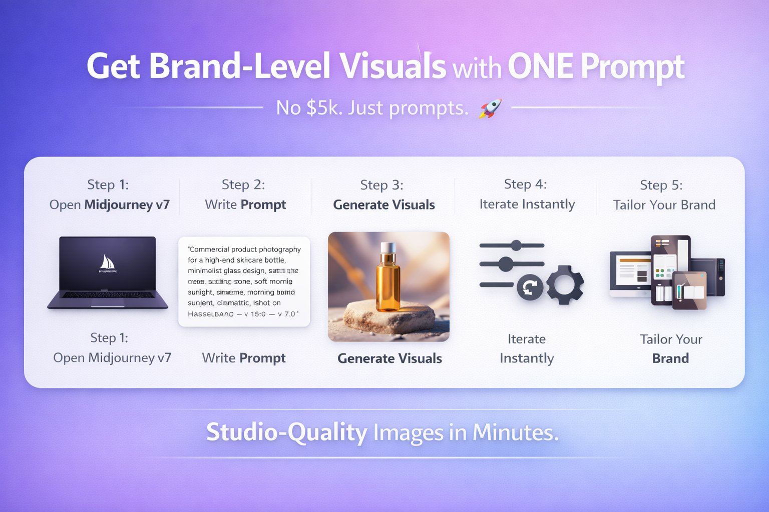
예시 하나를 복사하고 대괄호 변수만 바꾼 뒤 첫 생성에서는 나머지를 고정하세요. Prompt blocks 는 어떤 언어에서도 바로 Vogue AI 에 붙여넣을 수 있도록 영어로 유지합니다.
- Minimal symbol infographic: A clean vector-style infographic mark for [brand name], combining [core object] and [brand attribute], simple geometric silhouette, strong negative space, one-color black on white, balanced proportions, no words, no mockup, no gradients.
- Comparison infographic: Side-by-side infographic comparing [option A] and [option B], 4 criteria rows, balanced columns, simple icons, clean grid, headline-safe top area, 4:5 aspect ratio, placeholder labels only, no watermark.
- Blueprint infographic: Elegant blueprint-style infographic for [object or concept], labeled zones, thin technical lines, numbered callouts, generous margins, editorial blue-and-cream palette, no dense paragraphs, no watermark.
- Data story infographic: Magazine-style data explainer about [topic], one hero statistic, three supporting panels, simple chart-like shapes, strong contrast, readable spacing, 16:9 aspect ratio, placeholder numbers only.
실제 이미지와 prompt 가 붙은 두 가지 케이스
이런 글은 공식만 설명하면 약합니다. 아래 두 케이스는 Vogue AI prompt library 에서 가져온 실제 사례로, 실제 이미지와 실제 prompt, 그리고 재사용할 구조를 함께 보여줍니다.
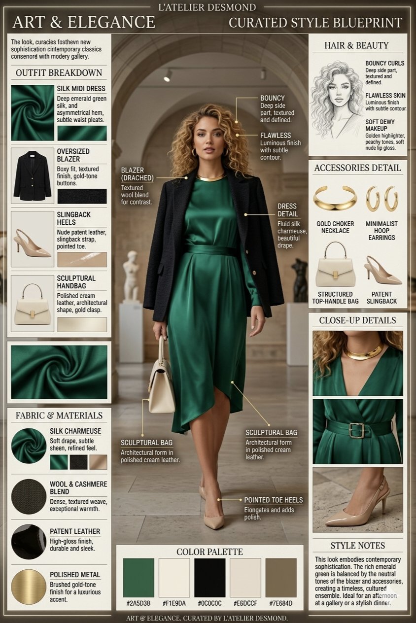
케이스 1: callout 제어를 위한 기술 블루프린트 구조
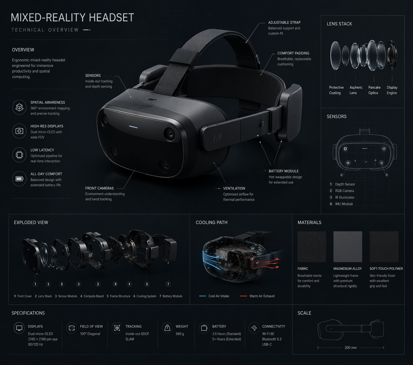
여기서 가져가야 할 것은 특정 object 가 아니라 hero view, numbered callouts, generous margins, 그리고 labels 를 짧게 유지하는 output rule 입니다.
- Prompt: Technical blueprint infographic for [product or concept], orthographic hero view, labeled component zones, numbered callouts, thin technical lines, generous margins, cool blue-and-cream palette, placeholder labels only, no dense paragraphs, no watermark.
케이스 2: 의사결정을 명확히 하는 브랜드 시스템 인포그래픽
이 케이스는 brand system 을 이해하기 쉽게 유지하는 구조입니다. promise, audience, palette, logo-safe area, service pillars 를 분리된 zones 로 두면 번역과 디자인 정리가 쉬워집니다.
- Prompt: Professional branding infographic for [business], showing brand promise, audience, palette, logo-safe area, three service pillars, and channel examples, editorial grid, clean hierarchy, placeholder copy only, no final claims, no watermark.
완전한 예시: launch brief 에서 첫 prompt 까지
원본 brief
5단계 onboarding process 를 위한 launch infographic 이 필요합니다. process explainer 와 lesson handout 둘 다에 써야 하고, 단계 순서와 짧은 labels 는 안정적으로 유지되어야 하며, 위쪽에는 나중에 headline 을 넣을 공간이 필요합니다.
Prompt version 1
- Clean vertical onboarding infographic for a five-step onboarding process, five numbered sections from [STEP 1] to [STEP 5], one simple icon per step, consistent spacing, clear hierarchy, friendly SaaS education style, top area left open for a future headline, placeholder labels only, 4:5 aspect ratio, no dense paragraphs, no watermark.
첫 생성 후 수정
step order 는 맞는데 labels 가 좁게 보이면 전체를 다시 쓰지 마세요. labels 를 줄이고 spacing 을 늘린 뒤 five-section structure 는 유지하세요. layout 은 명확하지만 icons 가 generic 하면 icon style, palette, background treatment 만 조정합니다.
형용사를 더하기 전에 할 일
약한 prompt 의 대부분은 멋진 단어가 부족해서가 아니라 핵심 control 이 빠져서 실패합니다. 먼저 정확성, 그다음 분위기입니다.
- frame 이 어수선하면 crop, angle, negative space 를 추가합니다.
- subject 가 흔들리면 subject sentence 를 조이거나 reference 를 넣습니다.
- style 이 generic 하면 audience, channel, palette 를 추가합니다.
- text 가 깨지면 prompt 에서 text 를 빼고 디자인 단계에서 넣습니다.
Vogue AI 안에서 model 고르기
Vogue AI 안에서는 prompt skeleton 을 최대한 유지하고, model choice 는 production risk 에 맞춰 바꿉니다.
- GPT Image 2 는 instruction control 과 object fidelity 가 중요할 때 적합합니다.
- Nano Banana 는 빠른 variation 과 가벼운 image-to-image 에 적합합니다.
- Midjourney 는 mood-heavy, editorial, stylized exploration 에 적합합니다.
- model 을 바꿔도 skeleton 을 유지하면 무엇이 결과를 바꿨는지 추적하기 쉽습니다.
첫 생성 후 무엇을 바꿔야 하나
첫 생성은 prompt 문장 자체가 아니라 real job 과 비교해 평가하세요. 가장 큰 production failure 를 먼저 고치는 것이 가장 빠른 개선 방법입니다.
| 문제 | 먼저 고칠 것 | 피할 것 |
|---|---|---|
| product, face, screen identity 가 틀림 | subject 를 강화하거나 명시적 규칙이 있는 reference image 를 추가. | identity 가 안정되기 전에 mood adjectives 를 더하는 것. |
| composition 이 약함 | crop, distance, angle, negative space 를 수정. | frame 수정 전에 model 을 바꾸는 것. |
| style 이 generic 함 | audience, palette, material, channel context 를 추가. | prompt 전체를 다시 쓰는 것. |
| text 나 infographic 가 깨짐 | text generation 을 빼고 깨끗한 영역을 남김. | 최종 marketing copy 를 완벽히 쓰게 하는 것. |
| 좋은 결과가 점점 흔들림 | best version 을 복제하고 variables 만 교체. | 불안정한 prompt 에 수정을 계속 쌓는 것. |
- identity 문제: subject boundary 나 reference handoff 부터.
- layout 문제: 그다음 ratio, crop, empty space.
- style 문제: frame 이 안정된 뒤 palette, lighting, audience.
- production 문제: text, legal copy, 작은 UI details 는 디자인 도구에서 나중에 처리.
FAQ
좋은 인포그래픽 프롬프트는 무엇인가요?
subject, composition, style, output rule, review check 가 충분히 명확해서 첫 결과를 real brief 와 비교할 수 있는 prompt 입니다.
항상 긴 prompt 가 필요한가요?
항상 그렇지는 않습니다. subject, frame, output 을 통제할 만큼의 detail 이면 충분합니다. 장식적인 표현은 그다음입니다.
reference image 는 언제 써야 하나요?
identity 가 중요할 때입니다. product shape, packaging, face, infographic placement, palette, UI hierarchy 같은 요소가 해당됩니다.
Vogue AI 에서는 어떤 model 부터 시도해야 하나요?
risk 에 따라 고르세요. GPT Image 2 는 control, Nano Banana 는 빠른 variation, Midjourney 는 stylized exploration 에 적합합니다.
왜 결과가 계속 generic 해지나요?
대개 audience, channel, palette, composition rules 가 빠져 있기 때문입니다. generic output 은 vague brief 에서 나옵니다.
개선 사항을 reusable 하게 남기려면?
문제를 해결한 version 을 저장하고 variables 를 명확히 표시한 뒤 다음 visual 의 출발점으로 재사용하세요.