한국어: A useful Stable Diffusion prompt guide should help you control the first result, not memorize magic words. Stable Diffusion responds well when the prompt separates subject, composition, style modifiers, technical hints, and negative prompts, then changes one part at a time.
한국어 - TL;DR: the Stable Diffusion prompt structure
- 한국어: Write the main subject first, then add composition, lighting, style, and output constraints.
- 한국어: Use negative prompts for visible failure modes: extra fingers, bad anatomy, warped text, duplicate objects, low quality, and watermark.
- 한국어: Keep style modifiers specific. “Cinematic rim light, 50mm lens, matte product texture” is stronger than a long pile of vague adjectives.
- 한국어: Change one control per generation so you know whether the subject, crop, style, seed, or negative prompt fixed the image.
- 한국어: In Vogue AI, reuse the same anatomy across GPT Image 2, Nano Banana, and Midjourney style prompts so your briefs stay portable.
한국어 - Prompt anatomy
| 한국어: Part | 한국어: What to write | 한국어: Why it matters |
|---|---|---|
| 한국어: Subject | 한국어: The exact person, product, scene, object, or environment. | 한국어: The model needs a stable anchor before style instructions can help. |
| 한국어: Composition | 한국어: Camera distance, angle, crop, foreground, background, and negative space. | 한국어: Composition prevents visually impressive but unusable images. |
| 한국어: Style modifiers | 한국어: Lighting, medium, lens feel, palette, material, era, and realism level. | 한국어: Modifiers tune the look after the subject is clear. |
| 한국어: Negative prompt | 한국어: Visible errors you want to suppress. | 한국어: Stable Diffusion often benefits from an explicit error blacklist. |
| 한국어: Iteration rule | 한국어: The one element to change after the first result. | 한국어: A controlled prompt is easier to debug than a rewritten prompt. |
한국어 - A practical Stable Diffusion formula
한국어: Use this order for most prompts: subject, scene role, composition, lighting, style, technical hint, output rule, negative prompt. You can shorten it later, but the first draft should make every control visible.
- 한국어: Positive prompt: [subject], [scene or job], [composition], [lighting], [style], [material or texture], [camera/lens hint], [aspect/crop goal].
- 한국어: Negative prompt: low quality, blurry, watermark, unreadable text, extra limbs, distorted hands, duplicate subject, bad anatomy, warped logo.
- 한국어: Revision note: if the subject is wrong, fix the subject or reference first; if the image is generic, fix modifiers; if the layout is wrong, fix composition.
한국어 - Copyable prompt examples
한국어: Keep these public prompt blocks in English when you paste them. Replace bracketed fields, then adjust only one control after the first generation.
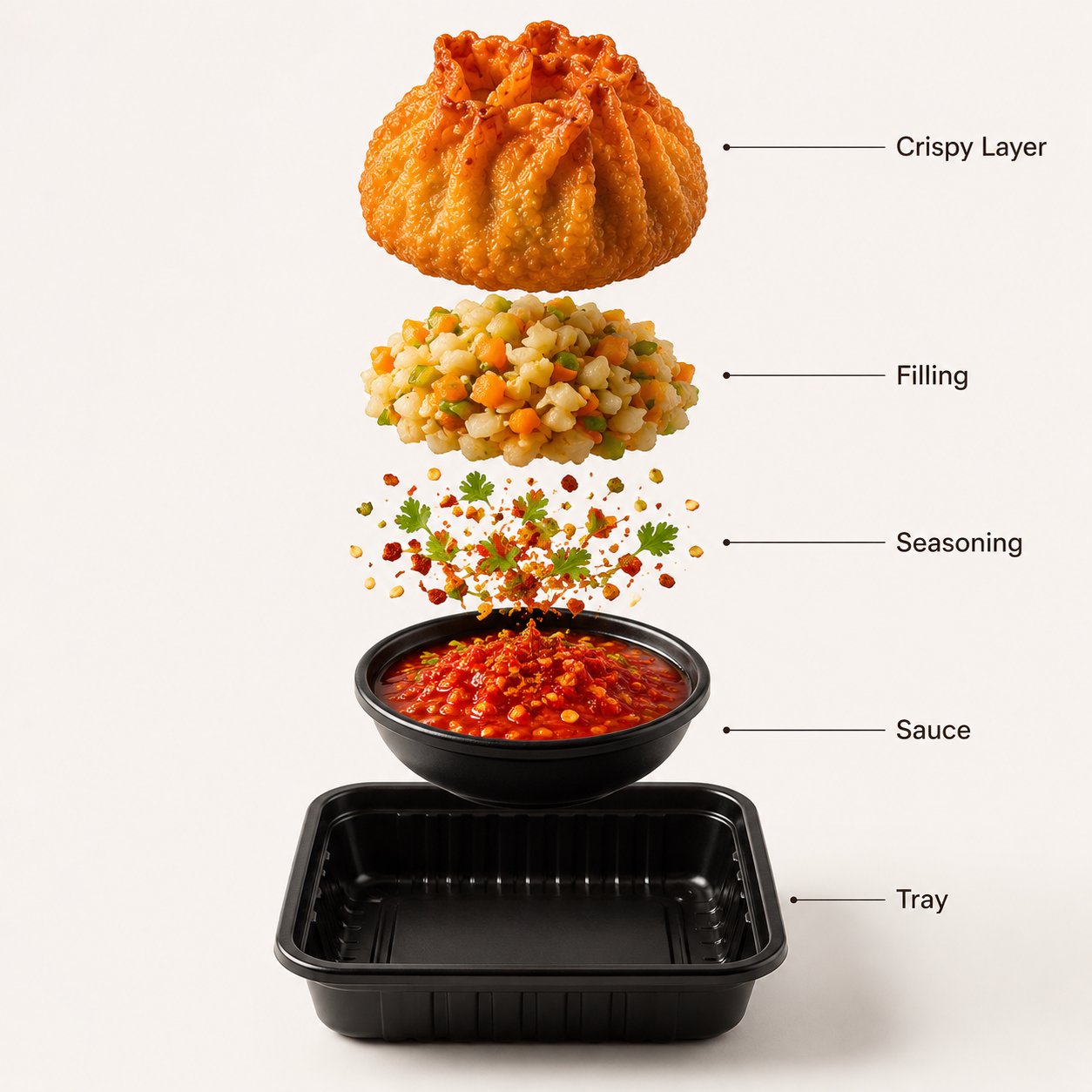
- Stable Diffusion product prompt: premium studio product photo of [product], centered composition, 50mm lens, softbox key light, crisp material texture, clean [background color] backdrop, subtle contact shadow, commercial realism, no text, no watermark, no deformed logo.
- Stable Diffusion portrait prompt: editorial portrait of [subject], natural skin texture, sharp eyes, relaxed confident expression, soft background separation, wardrobe in [palette], 85mm lens look, cinematic daylight, no extra fingers, no distorted face, no text.
- Stable Diffusion environment prompt: cinematic wide landscape of [place], clear foreground subject, layered depth, golden-hour side light, atmospheric perspective, realistic terrain detail, coherent scale, no duplicate horizon, no text, no watermark.
- Vogue AI rewrite prompt: Create a controlled image of [subject] for [channel]. Keep [identity element] stable, use [composition], [lighting], [style], [aspect ratio], and avoid [failure mode].
한국어 - Positive vs negative prompt decisions
| 한국어: Goal | 한국어: Put in positive prompt | 한국어: Put in negative prompt |
|---|---|---|
| 한국어: Better hands or faces | 한국어: Natural hand pose, sharp eyes, realistic skin texture. | 한국어: extra fingers, fused fingers, distorted face, asymmetrical eyes. |
| 한국어: Cleaner product image | 한국어: Centered product, crisp material, soft contact shadow. | 한국어: warped logo, unreadable label, watermark, duplicate product. |
| 한국어: Readable composition | 한국어: Clear foreground subject, simple background, negative space. | 한국어: cluttered background, cropped subject, duplicate horizon. |
| 한국어: Specific style | 한국어: Editorial photo, watercolor, anime cel shading, isometric render. | 한국어: low quality, muddy colors, noisy texture. |
한국어 - Worked example: from vague idea to controlled prompt
한국어: Raw idea: “make a cool mountain cabin image.” That is too open. A controlled Stable Diffusion prompt names the subject, camera, light, season, and common failures.
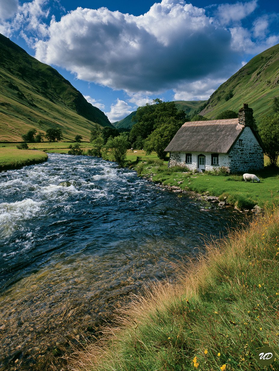
- 한국어: Version 1: cinematic wide landscape photograph of a small modern mountain cabin beside a clear alpine lake, foreground rocks and pine branches, golden-hour side light, mist in distant valley, realistic terrain detail, 24mm lens look, coherent scale, no people, no text, no watermark, no duplicate cabin.
- 한국어: If the cabin is too small, change composition: medium-wide framing, cabin occupies 30 percent of frame.
- 한국어: If the image becomes fantasy instead of realistic, reduce style language and add documentary landscape photography, natural colors, realistic material detail.
한국어 - Style modifiers that actually help
- 한국어: Lighting: softbox, rim light, golden hour, overcast daylight, hard flash, volumetric light.
- 한국어: Camera feel: 24mm wide angle, 50mm product lens, 85mm portrait look, macro close-up, top-down flat lay.
- 한국어: Medium: editorial photo, clay render, watercolor illustration, anime cel shading, ink poster, isometric 3D.
- 한국어: Material: brushed aluminum, matte ceramic, translucent glass, woven fabric, glossy enamel.
- 한국어: Channel: ecommerce hero, app store preview, vertical social poster, editorial cover, thumbnail-safe crop.
한국어 - When to use reference images in Vogue AI
한국어: Stable Diffusion users often rely on seeds, LoRA, ControlNet, or image-to-image workflows for consistency. In Vogue AI, the simpler public workflow is to attach a reference image when identity matters, then state exactly what the reference controls.
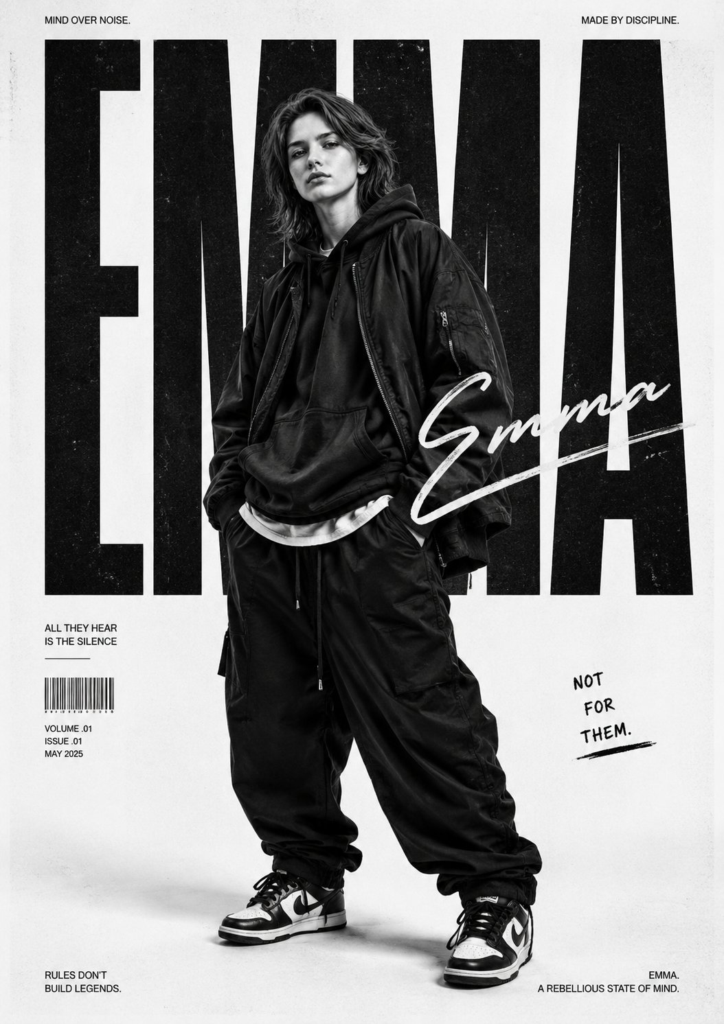
- 한국어: Use a reference for face identity, product silhouette, package color, UI hierarchy, or logo placement.
- 한국어: Do not use a reference just because the prompt feels weak; first fix subject and composition.
- 한국어: Write the handoff sentence: use the uploaded image for identity and shape only; reinterpret lighting, wardrobe, background, and mood.
한국어 - Mistake and fix table
| 한국어: Problem | 한국어: Likely cause | 한국어: Fix first |
|---|---|---|
| 한국어: Prompt looks good but output is random | 한국어: Subject and composition are buried after style words. | 한국어: Move subject and frame to the first sentence. |
| 한국어: Negative prompt does nothing | 한국어: It lists abstract dislikes instead of visible errors. | 한국어: Use concrete failures: extra fingers, watermark, duplicate object. |
| 한국어: Image is pretty but unusable | 한국어: No channel or crop rule. | 한국어: Add ecommerce hero, 9:16 poster, 4:5 product crop, or text-safe area. |
| 한국어: Style keeps drifting | 한국어: Too many competing modifiers. | 한국어: Pick one medium, one lighting setup, and one palette. |
FAQ
한국어 - What is the best Stable Diffusion prompt format?
한국어: The most reliable format is subject, composition, style modifiers, technical hints, output rules, then negative prompt. It is not the only format, but it is easy to debug.
한국어 - How long should a Stable Diffusion prompt be?
한국어: Long enough to control the job. For most images, 25 to 70 meaningful words plus a short negative prompt is easier to manage than a huge adjective list.
한국어 - Should I always use negative prompts?
한국어: Use them when you can name visible failures. Negative prompts are useful for anatomy, text, watermarks, duplicate objects, blur, and low-quality artifacts.
한국어 - Can I use the same prompt in Vogue AI?
한국어: Yes, but translate model-specific syntax into a clear creative brief. Keep the subject, composition, style, and avoid-list, then add a reference image when identity matters.
한국어 - Why does my prompt ignore important details?
한국어: The usual reason is competing priorities. Put the most important subject and composition details first, remove weak modifiers, and revise one control at a time.
한국어 - Are style words like 8K and masterpiece required?
한국어: No. Some older Stable Diffusion workflows used quality tags heavily, but clear subject, lighting, composition, and failure controls usually matter more.