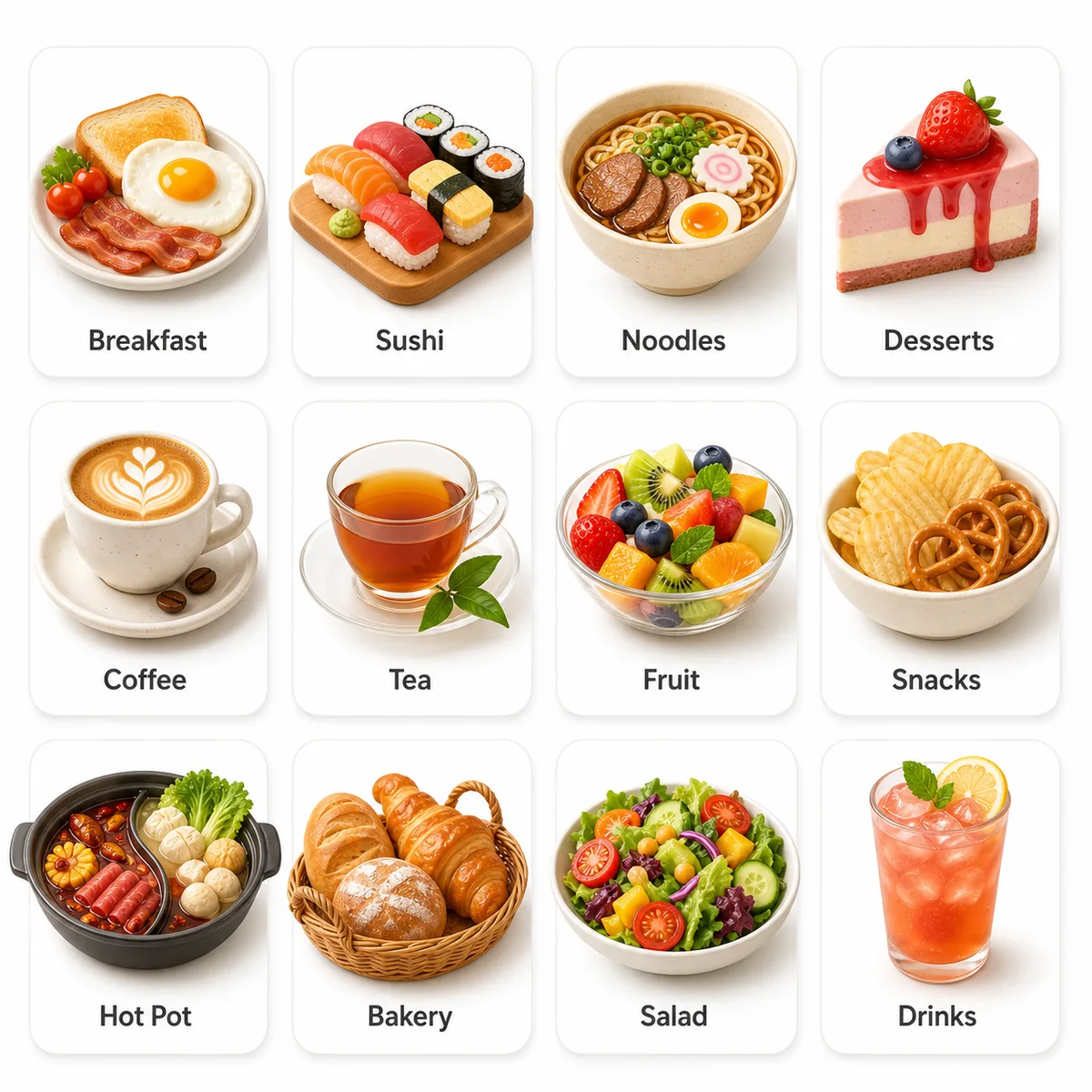
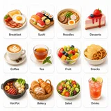
Theme: Complete homepage category icon grid for neighborhood cafe ordering app, covering breakfast, sushi, noodles, desserts, coffee, tea, fruit, snacks, hot pot, bakery, salad, drinks.
Subject: breakfast, sushi, noodles, desserts, coffee, tea, fruit, snacks, hot pot, bakery, salad, drinks appear as 12 distinct food or service category icons; 12 concise food category labels for a homepage grid appear beneath or inside each card as short readable labels.
Scene: Clean app-homepage presentation on a white or very light UI background with rounded-corner category cards and generous spacing.
Composition: Fixed 12-card homepage grid with consistent icon scale, equal card padding, aligned rows and columns, clear category hierarchy, and production-quality mobile app spacing.
Signature elements: Twelve takeaway category cards, plump clay 3D food icons, white rounded cards, consistent shadows, clear labels, and polished local delivery app homepage visual language.
Style: Professional app icon designer finish with clay-style 3D skeuomorphism, round plump forms, soft bevels, friendly food-app polish, and cohesive icon family consistency.
Color palette: Bright appetizing food colors balanced with clean white cards, soft neutral shadows, pastel highlights, and enough contrast for labels and object silhouettes.
Lighting: Soft studio UI lighting with gentle clay-material shadows, subtle top-left highlights, and consistent depth across every icon.
Camera: Clean focused visual treatment with coherent detail and source-consistent structure.
Materials: Clay-like 3D food surfaces, rounded card backgrounds, soft plastic or ceramic-like highlights, and crisp label rendering.
Typography: Clean focused visual treatment with coherent detail and source-consistent structure.
Restrictions: Keep the transformed subject coherent, preserve the intended composition, maintain crisp visual detail, use clean readable text when present, and keep the background focused and uncluttered.