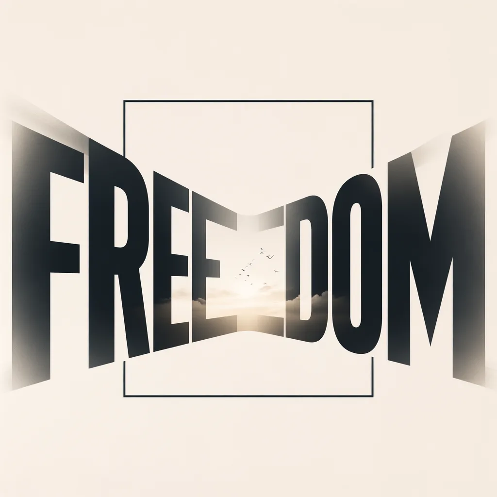
Theme: Typography-first semantic concept poster for FREEDOM, making the word the largest, clearest, and most memorable subject while translating specific semantic mood variant with readable visual details.
Subject: FREEDOM appears as oversized readable custom lettering shaped by specific type structure variant with readable visual details; the lettering itself carries the concept instead of acting like a caption on a background.
Scene: fixed source visual style, lighting, and render finish with concrete medium cues from the prompt forms the controlled visual world around, inside, or behind the letterforms; every secondary object, space, texture, and symbol exists only to strengthen the word meaning.
Composition: Fixed word-first hierarchy: the target word occupies the dominant visual zone, supporting metaphors orbit or intersect the letterforms, and the background stays subordinate with deliberate negative space.
Signature elements: Clean focused visual treatment with coherent detail and source-consistent structure. Fixed source details:
Visual metaphor: letters expanding beyond a precise frame.
Style: Top-tier typography art direction with custom lettering, mature graphic design, conceptual poster finish, precise spacing, high visual hierarchy, and a design language chosen by semantic meaning rather than a generic template look.
Color palette: Clean focused visual treatment with coherent detail and source-consistent structure.
Lighting: Light, shadow, texture, and depth serve the
Typography: they clarify letter edges, support the metaphor, and never overpower the readable word.
Typography: FREEDOM is the primary image; spelling must be exact, letter spacing and weight must feel custom, and the letter structure must communicate specific semantic mood variant with readable visual details while remaining readable at first glance.
Restrictions: Clean focused visual treatment with coherent detail and source-consistent structure.