App design prompts are useful when they describe the screen as a product system, not as a pretty rectangle. Start with the user job, layout hierarchy, device frame, component inventory, state, and the review rule you will use after the first generation.
TL;DR: write the app brief before the visual style
- Name the screen job first: onboarding, dashboard, editor, checkout, product detail, profile, or marketing mockup.
- Specify layout hierarchy before color: navigation, primary panel, secondary controls, cards, table, chart, empty state, CTA, and safe areas.
- Use reference images when product identity, existing layout, visual system, or a real UI hierarchy must survive.
- Keep final copy, accessibility review, component logic, and production code outside the generated image.
- In Vogue AI, keep one prompt skeleton and test GPT Image 2, Nano Banana, or Midjourney based on the failure risk.
Image plan for this guide
| Role | Section | First-party source | Why it matches |
|---|---|---|---|
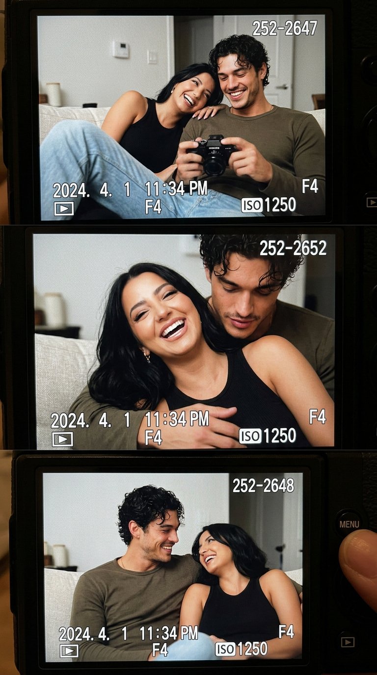
| Hero | Article overview | https://media.vogueai.net/blog/auto/ui-screenshot-prompts/43e96f7ae159-concept-couch-couple-camera-lcd-screen-nostalgia-1.jpg | A first-party screen-framing example that signals app presentation and device-based UI work without repeating the first concrete case. |
| Prompt blocks | Copyable app design prompts | https://media.vogueai.net/blog/auto/ui-screenshot-prompts/43e96f7ae159-concept-couch-couple-camera-lcd-screen-nostalgia-1.jpg | Shows screen hierarchy and framed product presentation close to the copyable prompt examples. |
| Worked example | AI fashion livestream dashboard | https://media.vogueai.net/prompt-libraries/awesome-gptimage2-prompts/vogueai-20260615-fashion-livestream-host-smiling-ui-screenshot-ai-prompt/fashion-livestream-host-smiling-ui-screenshot-ai-prompt-ai-image-prompt-x2064967186935120256-v1-schema-01.png | Matches the dashboard case: host preview, commerce controls, product queue, and app interface hierarchy. |
Scenario matrix
| App job | Prompt pattern | Reference image | First failure to check |
|---|---|---|---|
| Mobile onboarding | Screen purpose, benefit cards, thumb-safe CTA, progress state, mobile ratio. | Optional unless matching an existing brand system. | Too much copy, weak CTA, tiny labels, or no clear next action. |
| SaaS dashboard | Sidebar, filter bar, KPI cards, chart, table, data density, desktop frame. | Useful when an existing product layout must remain recognizable. | Fake metrics, decorative charts, cluttered hierarchy, unreadable dense text. |
| Marketplace detail | Product media, trust signals, seller card, price, sticky CTA, ecommerce density. | Useful when product photography or marketplace rules matter. | CTA hidden, trust hierarchy weak, screen looks like a poster instead of an app. |
| AI editor | Input area, preview canvas, settings drawer, status chips, history, output state. | Useful when the workflow has an existing panel structure. | Pretty screenshot with no actual workflow logic. |
| App-store mockup | Device frames, key screens, reflection control, readable hierarchy. | Optional unless the real app screen must be accurate. | Decorative device angle that hides the interface. |
Prompt anatomy
| Part | What to write | Why it matters |
|---|---|---|
| Screen job | The user task and product context in one sentence. | Prevents generic app screenshots that have no usable purpose. |
| Layout regions | Navigation, content, controls, detail panel, status area, safe area. | Gives the model a structural map before style words. |
| Component inventory | Cards, tabs, forms, table, chart, timeline, empty state, CTA. | Turns the image into a design brief instead of a mood board. |
| Device and density | iOS, Android, browser, desktop, 9:16, 16:9, compact or spacious. | Controls crop, spacing, and whether the output can be inspected. |
| Text policy | Readable generic labels, no exact legal copy, no brand logo, no distorted text. | Avoids over-promising exact typography inside an image model. |
| Review rule | The first failure you will inspect after generation. | Makes iteration specific instead of rewriting the whole prompt. |
Copyable app design prompt blocks
Copy one prompt, replace the bracketed variables, and keep the structure stable for the first generation. The prompt blocks stay in English so they remain paste-ready across Vogue AI locales.
- Mobile onboarding app screen: Realistic iOS app design for [app category], one clear welcome headline area, three benefit cards, thumb-safe primary CTA, bottom progress dots, clean product hierarchy, soft neutral background, 9:16 aspect ratio, readable generic labels only, no fake brand logo, no distorted text.
- SaaS dashboard app design: High-resolution desktop web app screen for [product category], left sidebar navigation, top filter bar, primary KPI cards, one chart panel, one data table, visible empty or loading state, realistic SaaS spacing, 16:9 browser frame, readable generic labels, no brand logos, no watermark.
- Marketplace product-detail screen: Modern mobile app screen for [marketplace niche], large product media area, compact seller card, price and trust signals, sticky bottom CTA, clean card hierarchy, realistic ecommerce UI density, 9:16 aspect ratio, no exact legal copy, no distorted text.
- AI productivity editor: Desktop app design for [workflow], split layout with input panel, preview canvas, right settings drawer, status chips, version history, restrained professional UI, 16:9 aspect ratio, readable generic labels, no decorative filler.
- App store presentation mockup: Premium marketing image for [app name], two realistic device frames showing key screens, visible interface hierarchy, soft reflection control, clean desk context, 16:9 aspect ratio, screen remains readable, no fake logo, no watermark.
Worked example: AI fashion livestream dashboard
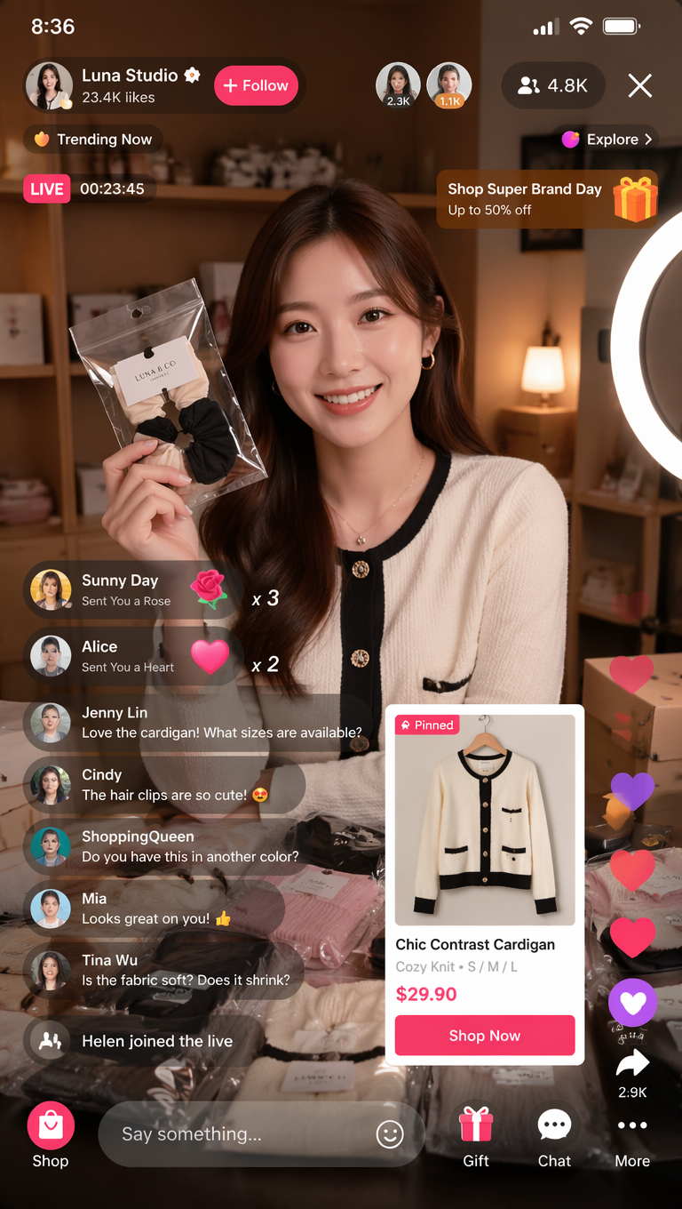
Raw job
You need a credible app design concept for a livestream commerce control room. The screen should show host preview, product queue, live metrics, chat, and action controls, but it should not pretend to be final production UI.
Prompt version 1
- High-resolution desktop app design screenshot for an AI fashion livestream control room, left sidebar with simple navigation icons, central live preview panel with a smiling fashion host, right product queue cards, bottom timeline controls, compact live chat column, live metrics cards, premium ecommerce UI hierarchy, clean light interface, realistic browser frame, 16:9 aspect ratio, readable generic labels only, no brand logo, no distorted text.
First-result diagnosis
If the host preview looks good but the app is fake, tighten the component inventory and remove vague style words. If the screen hierarchy works but labels break, keep generic labels and add final copy later in Figma or code. If the frame hides the interface, reduce reflections and require a straight-on browser screenshot.
Mistake and fix table
| Failure | Fix first | Avoid |
|---|---|---|
| Looks like a poster, not an app | Name the screen job and component inventory. | Adding more modern UI adjectives. |
| Hierarchy is confusing | Specify primary, secondary, and tertiary regions. | Changing color palette before structure. |
| Text is broken | Ask for readable generic labels and add final copy later. | Requesting exact final marketing copy inside the image. |
| Device frame hides the interface | Use straight-on browser or phone screenshot framing. | Choosing a dramatic angle over readability. |
| Screenshot-to-code handoff is weak | Write components, states, spacing, and responsive behavior beside the image. | Treating a generated screenshot as production design. |
How to use the prompts inside Vogue AI
- Use GPT Image 2 when layout control, instruction following, and screen hierarchy are the priority.
- Use Nano Banana for fast variants, mobile-screen exploration, and quick image-to-image passes.
- Use Midjourney when the app concept is more editorial, fashion-led, or presentation-focused than exact UI.
- Keep the prompt skeleton stable when switching models so you learn whether the model or the wording changed the result.
- For screenshot-to-code, pair the generated visual with a component brief that names states, spacing, responsive behavior, and accessibility requirements.
FAQ
What are app design prompts?
They are structured text briefs that ask an image model to render app screens, dashboards, mobile flows, or product mockups with a specific hierarchy and device frame.
Can app design prompts replace Figma?
No. They help with concept visuals, hierarchy exploration, and presentation mockups. Final interaction logic, accessibility, exact copy, components, and code still need design and engineering review.
Should students use simpler app design prompts?
Students should still include screen job, layout regions, component inventory, and a review rule. The brief can be shorter, but it should not skip hierarchy.
How do I make an app design prompt generator more useful?
Generate prompts from a small form: app type, user task, device, layout regions, components, state, visual tone, and text policy. Random style adjectives are less useful than structured variables.
Why does generated UI text look wrong?
Image models can struggle with exact text. Ask for readable generic labels, leave space for final copy, and add production typography in a design or code tool.
Which model should I try first?
Start with GPT Image 2 for layout control, Nano Banana for quick variants, and Midjourney for stylized product storytelling. Keep the same app prompt skeleton when comparing models.