Infographic prompts work when they read like a production brief, not a bag of adjectives. A strong prompt should tell the model what the subject is, how the frame should behave, what must stay fixed, and what you will judge after the first generation.
TL;DR: write prompts like a reusable production brief
- Start with subject, composition, style, output rule, and channel goal before adding mood words.
- Keep one prompt skeleton for recipe visuals, campaign layouts, social posters, and UI concepts, then swap only the variable fields.
- Treat the first result as a diagnosis step. Fix the largest failure first instead of rewriting the whole prompt.
- Add a reference image only when identity, packaging, face, color system, or UI hierarchy needs protection.
- Save the prompt version that solved the job and reuse it as the next starting point inside Vogue AI.
What these infographic prompts need to accomplish
The search intent behind infographic prompts is practical: the user wants a prompt they can copy, adapt, and turn into a controlled first draft. That means the article needs to teach structure, not just list inspiration.
- Good outcome: a prompt that generates a usable first draft for a recipe card, campaign layout, campaign visual, or interface concept.
- Bad outcome: a flashy paragraph that sounds creative but leaves the model free to change the wrong things.
- Key shift: judge prompts by whether they preserve the brief, not by whether they sound impressive in isolation.
Infographic prompt formula
| Prompt part | What to include | Why it matters |
|---|---|---|
| Subject | The exact product, person, object, scene, or screen you need. | Without a clear subject, every later style instruction becomes unstable. |
| Context | Where the image lives: product page, launch post, ad, gallery card, thumbnail, or UI showcase. | Channel context changes crop, density, and what counts as usable output. |
| Composition | Camera angle, crop, distance, negative space, and layout anchor. | Composition is the fastest way to prevent messy first generations. |
| Style | Material, realism level, mood, palette, and brand tone. | Style narrows the visual language without replacing subject control. |
| Lighting | Softbox, rim light, daylight, backlight, hard flash, or cinematic contrast. | Lighting often separates generic output from a publishable draft. |
| Output rules | Aspect ratio, no text, transparent background, safe area, or no watermark. | Output rules keep the result aligned with the real production job. |
| Reference handoff | What a reference image controls and what it can ignore. | Reference images are useful only when their role is explicit. |
| Review check | The first thing you will inspect after generation. | A review rule stops you from rewriting the whole prompt too early. |
Scenario matrix
| Goal | Prompt focus | Keep fixed | First thing to revise |
|---|---|---|---|
| Process infographic | Hero subject, material detail, launch lighting, and headline-safe space. | Product silhouette, packaging cues, and background hierarchy. | Crop and negative space before adding more style language. |
| Portrait campaign image | Expression, wardrobe, skin texture, camera distance, and palette. | Face identity, hair shape, and eye clarity when they matter. | Reference-image handoff before changing the whole mood. |
| Social poster | Focal point, contrast, channel ratio, and empty space for later text. | Subject hierarchy and the text-safe area. | Background clutter and headline space first. |
| UI concept visual | Device framing, interface hierarchy, desk context, and reflection control. | Screen structure and the product area users need to recognize. | Perspective and reflection noise before switching models. |
Copyable infographic prompt examples
Copy one of these examples, replace the bracketed variables, and keep the rest stable for the first pass. The prompts stay in English on purpose so they remain easy to paste into Vogue AI regardless of article locale.
- Minimal symbol infographic: A clean vector-style infographic mark for [brand name], combining [core object] and [brand attribute], simple geometric silhouette, strong negative space, one-color black on white, balanced proportions, no words, no mockup, no gradients.
- Comparison infographic: Side-by-side infographic comparing [option A] and [option B], 4 criteria rows, balanced columns, simple icons, clean grid, headline-safe top area, 4:5 aspect ratio, placeholder labels only, no watermark.
- Blueprint infographic: Elegant blueprint-style infographic for [object or concept], labeled zones, thin technical lines, numbered callouts, generous margins, editorial blue-and-cream palette, no dense paragraphs, no watermark.
- Data story infographic: Magazine-style data explainer about [topic], one hero statistic, three supporting panels, simple chart-like shapes, strong contrast, readable spacing, 16:9 aspect ratio, placeholder numbers only.
Two real prompt-library cases you can reuse
A strong blog post here should not stop at abstract formulas. These two Vogue AI prompt-library cases show the real image, the real prompt structure, and the part you should borrow when you adapt the prompt for your own job.
Case 1: technical blueprint structure with callout control
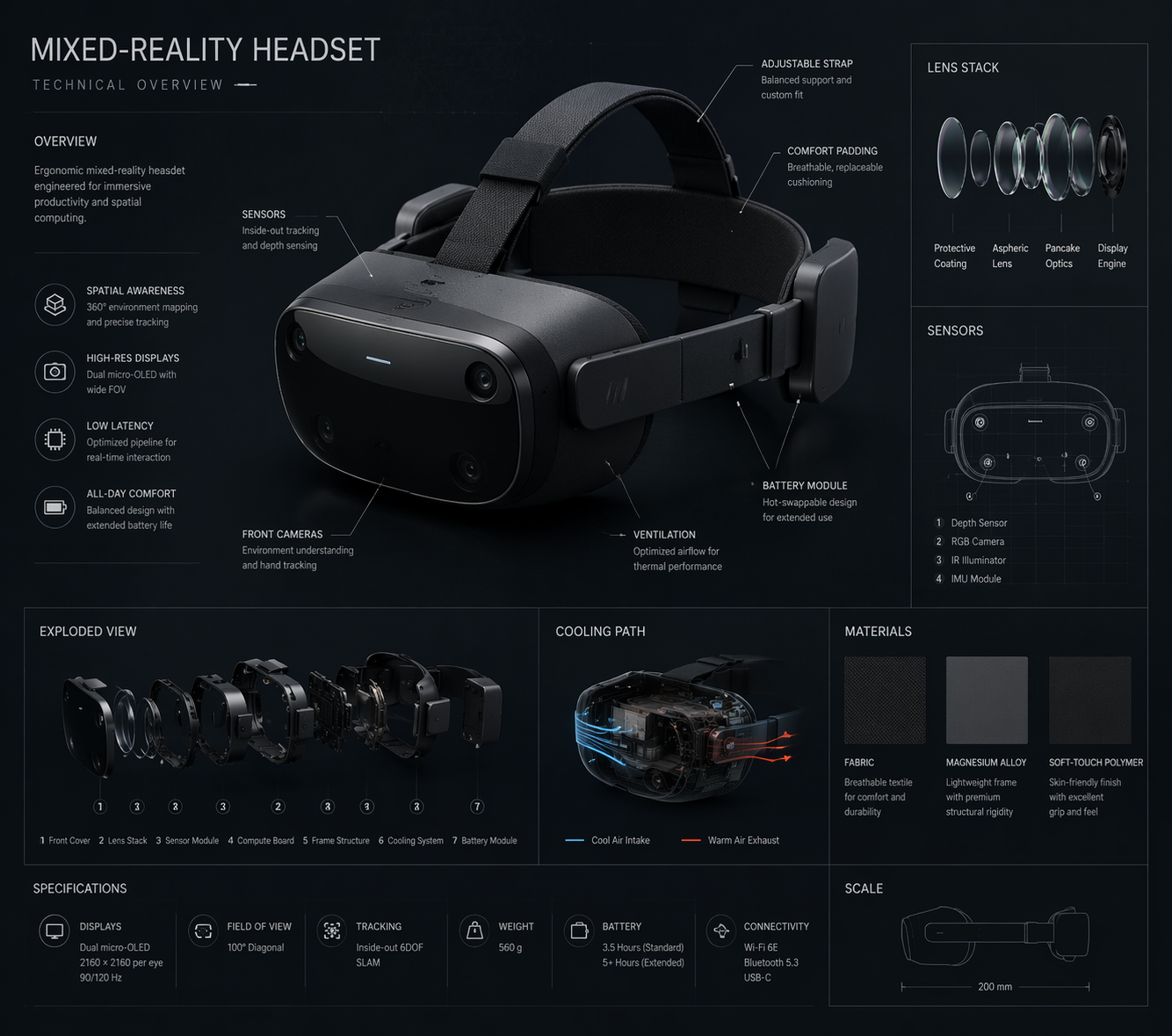
Borrow the structure here, not the exact device subject. The important part is the hero view, numbered callouts, generous margins, and the instruction that keeps labels short enough to stay readable.
- Prompt: Technical blueprint infographic for [product or concept], orthographic hero view, labeled component zones, numbered callouts, thin technical lines, generous margins, cool blue-and-cream palette, placeholder labels only, no dense paragraphs, no watermark.
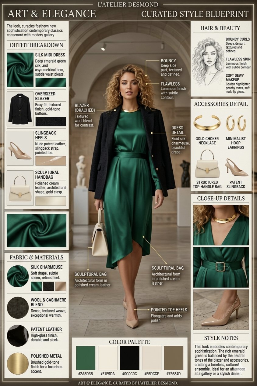
Case 2: brand-system infographic structure for decision clarity
This is the pattern to copy when the real job depends on a brand system remaining understandable. The key move is to keep promise, audience, palette, logo-safe area, and service pillars in separate zones so the visual stays useful after translation or design cleanup.
- Prompt: Professional branding infographic for [business], showing brand promise, audience, palette, logo-safe area, three service pillars, and channel examples, editorial grid, clean hierarchy, placeholder copy only, no final claims, no watermark.
Worked example: from launch brief to first prompt
Raw brief
You need a launch visual for a new five-step onboarding process. The image should work in a process explainer and on a lesson handout. The step order and section labels must stay stable, and the frame needs room for a future headline.
Prompt version 1
- Clean vertical onboarding infographic for a five-step onboarding process, five numbered sections from [STEP 1] to [STEP 5], one simple icon per step, consistent spacing, clear hierarchy, friendly SaaS education style, top area left open for a future headline, placeholder labels only, 4:5 aspect ratio, no dense paragraphs, no watermark.
First revision after generation
If the step order is correct but the labels feel cramped, do not rewrite the full prompt. Shorten the labels, increase spacing, and keep the five-section structure stable. If the layout is clear but the icons feel generic, keep the hierarchy and adjust only the icon style, palette, or background treatment.
Before you add more adjectives
Most weak infographic prompts fail because the important controls are missing, not because the wording is not fancy enough. Add precision before you add poetry.
- If the frame is messy, add crop, angle, and negative-space rules.
- If the subject drifts, tighten the subject sentence or attach a reference image.
- If the image feels generic, add audience, channel, and brand palette.
- If text generation keeps breaking, remove text from the prompt and reserve a clean area for later design.
Model fit inside Vogue AI
Inside Vogue AI, the prompt should stay stable while the model choice follows the failure risk. Pick the model for control, speed, or style exploration, not just because it is trending.
- Use GPT Image 2 when instruction following, object control, and scene revision matter most.
- Use Nano Banana when you want quick visual variations, lightweight exploration, or a fast image-to-image pass.
- Use Midjourney when the job is mood-heavy, editorial, fashion-led, or more about stylized exploration than strict fidelity.
- Keep the same prompt skeleton across models so you learn which model changes the result, not which wording changed it.
What to change after the first generation
Compare the first generation against the real job. The fastest way to improve a prompt is to name the largest production failure and fix only that layer first.
| Problem | Fix first | Avoid |
|---|---|---|
| Wrong product, face, or screen identity | Strengthen the subject sentence or add a reference image with an explicit control rule. | Adding more mood adjectives before identity is fixed. |
| Weak composition | Change crop, camera distance, angle, or negative space. | Switching models before the frame is corrected. |
| Generic style | Add audience, brand palette, material cues, and channel context. | Rewriting the entire prompt from scratch. |
| Broken text or infographics | Remove text generation and leave a clean area for later typography. | Trusting the model to spell final marketing copy perfectly. |
| Good result starts drifting | Duplicate the best prompt version and replace only variable fields. | Continuing to stack edits onto the same unstable prompt. |
- Identity issue: fix subject boundary or reference handoff first.
- Layout issue: fix ratio, crop, or empty space next.
- Style issue: fix palette, lighting, or audience after the frame is stable.
- Production issue: remove text, legal claims, or tiny UI details that should be added later in design tools.
FAQ
What makes a good infographic prompt?
A good infographic prompt names the subject, composition, style, output rule, and review check clearly enough that the first generation can be judged against the real brief.
Should I use long descriptive prompts every time?
Not automatically. Use enough detail to control subject, frame, and output. Extra decorative language is useful only after the prompt already protects the production goal.
When should I add a reference image?
Add one when identity matters: product shape, package details, face, infographic position, palette, or UI hierarchy. If the job is pure exploration, text-only prompts are often faster.
Which model should I try first in Vogue AI?
Start with the model that matches the failure risk. GPT Image 2 is better for instruction control, Nano Banana is better for quick variation, and Midjourney is better for stylized exploration.
Why do my infographic prompts keep producing generic images?
Usually because the prompt is missing audience, channel, palette, or composition rules. Generic outputs often come from vague briefs, not from insufficient word count.
How do I make prompt improvements reusable?
Save the prompt version that fixed the main job, label its variable fields clearly, and duplicate that version for the next campaign, campaign layout, recipe card, or UI concept.