The most useful prompt engineering tips are not abstract rules. For image generation, a strong prompt works like a production brief: it names the subject, fixes the visual hierarchy, explains what a reference image should preserve, and gives you a clean way to revise the first result.
TL;DR: write prompts in controllable layers
- Start with the job: product hero, portrait, poster, UI mockup, or concept exploration.
- Write the subject before style. If the subject is weak, every beautiful adjective becomes noise.
- Lock composition early: crop, camera distance, negative space, background, and aspect ratio.
- Use reference images only when they protect identity, shape, packaging, color, or UI hierarchy.
- Judge the first result by failure mode, then change one control at a time.
Who should use these prompt engineering tips
This workflow is for people who need repeatable image outputs, not one lucky generation. It is especially useful for product marketers, founders, creators, designers, and social teams who reuse the same visual idea across channels.
- Use it for product hero images, ecommerce visuals, creator portraits, ad concepts, UI mockups, and social campaign covers.
- Use it when a reference image must preserve identity, product shape, packaging, brand color, or interface hierarchy.
- Avoid treating the prompt as final art direction; use it as the first controlled brief before review and editing.
A practical prompt engineering formula
| Layer | What to write | Why it matters |
|---|---|---|
| Job | The asset you need: product page hero, avatar, social poster, ad concept, or UI showcase. | The job decides crop, density, and whether the image needs empty space for later text. |
| Subject | The exact product, person, screen, object, or scene. | Subject clarity prevents the model from styling the wrong thing beautifully. |
| Hierarchy | Main subject, secondary props, background, and what should stay visually quiet. | Hierarchy keeps the frame readable and reduces clutter. |
| Style anchor | Realism level, material, palette, era, camera mood, and lighting. | Style becomes useful after subject and hierarchy are stable. |
| Reference handoff | What the uploaded image controls and what can change. | Reference images fail when their role is vague. |
| Output rule | Aspect ratio, no text, no watermark, transparent background, safe area, or final review target. | Output rules connect the prompt to the actual publishing surface. |
Scenario matrix
| Goal | Prompt focus | Reference image | First quality check |
|---|---|---|---|
| Product hero | Product shape, material, angle, lighting, background, shadow, and ecommerce crop. | Use one when packaging, silhouette, logo position, or color must stay recognizable. | Check silhouette accuracy, material realism, label distortion, and empty space. |
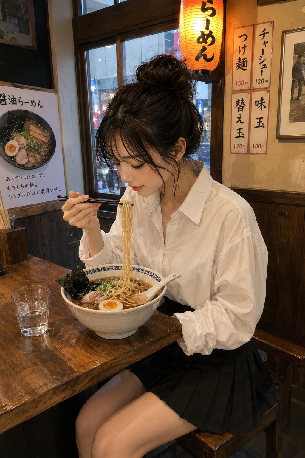
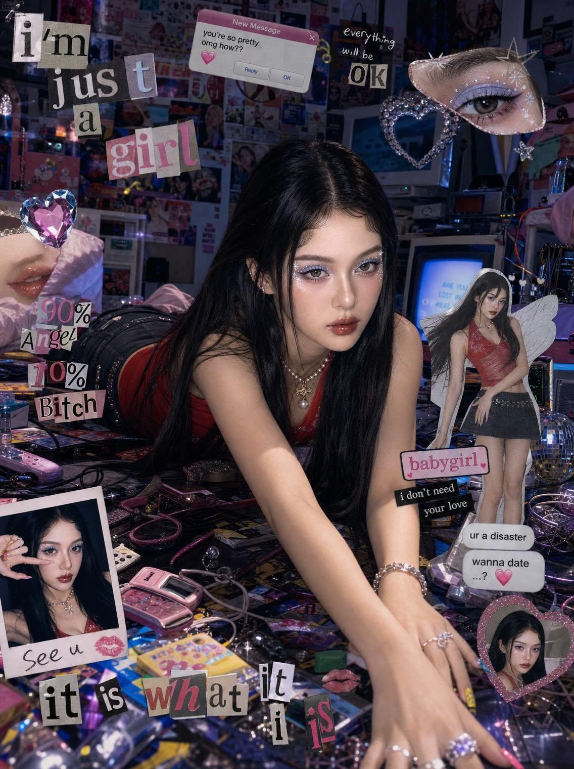
| Portrait or avatar | Identity, expression, wardrobe, background separation, lens, and skin texture. | Use one when face identity, hairstyle, or pose must remain stable. | Check eyes, age impression, skin texture, hair shape, and extra limbs. |
| Social poster | Main subject, channel format, negative space, color palette, and campaign mood. | Optional for mood; useful for brand palette or previous campaign continuity. | Check focal point, headline-safe area, generated text, and clutter. |
| UI showcase | Screen hierarchy, device angle, desk surface, reflection, and SaaS presentation style. | Use one when a real screen or app hierarchy must remain close to the source. | Check readable layout, device distortion, noisy reflections, and crop. |
| Concept exploration | Subject boundary, mood range, lighting direction, palette, and what must stay flexible. | Usually optional unless an existing concept board defines the direction. | Check whether the result teaches you what to refine next. |
Tip 1: separate subject control from style control
A common prompt mistake is mixing identity, mood, lighting, and output constraints into one long sentence. Split them mentally. First make sure the model knows what must exist. Then add how it should look. Then add what must not happen.
Tip 2: make reference-image instructions explicit
Do not just upload a reference image and hope the model guesses the right part to preserve. Say what the reference controls: face identity, product silhouette, package label placement, UI layout, color palette, or pose. Also say what may change, such as lighting, wardrobe, background, or camera crop.
| If you need | Reference should control | Prompt should allow |
|---|---|---|
| Product accuracy | Silhouette, packaging shape, label placement, material color. | Background, lighting, props, and camera angle within reason. |
| Portrait consistency | Face identity, hairstyle, expression, age impression. | Wardrobe, lighting, backdrop, and editorial mood. |
| Brand campaign continuity | Palette, product position, logo-safe area, visual hierarchy. | Set design, props, lighting, and crop variants. |
| UI mockup continuity | Screen layout, navigation shape, product hierarchy. | Device angle, desk surface, reflections, and environment. |
Tip 3: prompt for the first review, not the final miracle
A first generation should give you a controlled draft to inspect. Ask for a clean composition, not a perfect final asset. For product and marketing work, final typography, legal copy, exact price labels, and small UI text are usually safer in a design tool after generation.
Copyable prompt engineering examples
Copy one English block, replace the bracketed variables, and keep the rest stable for the first generation. Public prompt blocks stay in English so they remain paste-ready across locales.
- Product hero: Ultra-realistic studio product photo of [product], centered on a clean [background color] stage, crisp material detail, softbox lighting from upper left, subtle grounded shadow, premium ecommerce composition, 4:5 aspect ratio, no text, no watermark.
- Reference portrait: Use my uploaded image as the face reference. Preserve [face identity / hairstyle / expression], change the wardrobe to [style], clean editorial lighting, natural skin texture, sharp eyes, 3:4 crop, no extra hands, no text.
- Social campaign visual: High-impact campaign image for [topic], main subject [subject], bold negative space for a future headline, [brand color palette], cinematic rim light, modern fashion editorial framing, 9:16 vertical, no generated text.
- UI showcase: Premium product marketing image showing [app or website] on a modern device, readable interface hierarchy, clean desk surface, restrained reflections, soft ambient light, 16:9 aspect ratio, no fake buttons, no text overlays.
Before and after: a weak prompt rewritten
Weak prompt
Make a cool product photo for my new headphones, premium and futuristic.
Better engineered prompt
- Premium studio product hero for matte black wireless headphones, centered three-quarter angle, ear cups clearly visible, clean graphite background, softbox reflection on metal details, subtle shadow, empty space above for later headline, ecommerce realism, 4:5 aspect ratio, no generated text, no watermark.
Why the rewrite works
The rewrite gives the model a product category, angle, material, background, lighting, text policy, and crop. If the result fails, you can now diagnose the failure: wrong silhouette, weak lighting, too little headline space, or style too generic.
Two reusable case prompts from the library
The fastest way to improve prompt engineering is to compare the prompt against a real visual target. These two cases show how to keep the brief specific while still leaving room for model interpretation.
Case 1: product-shot structure with material and background control
- Prompt: Premium streetwear T-shirt graphic design on a solid garment mockup, oversized cotton texture, bold central illustration, clean studio background, sharp fabric folds, ecommerce-ready product composition, no generated text, no watermark.
- Review: confirm the fabric texture, graphic placement, garment shape, shadow, and crop before changing the mood.
- First fix: if the product looks generic, add material detail, audience, and selling context before adding more dramatic lighting.
Case 2: campaign poster structure with controlled negative space
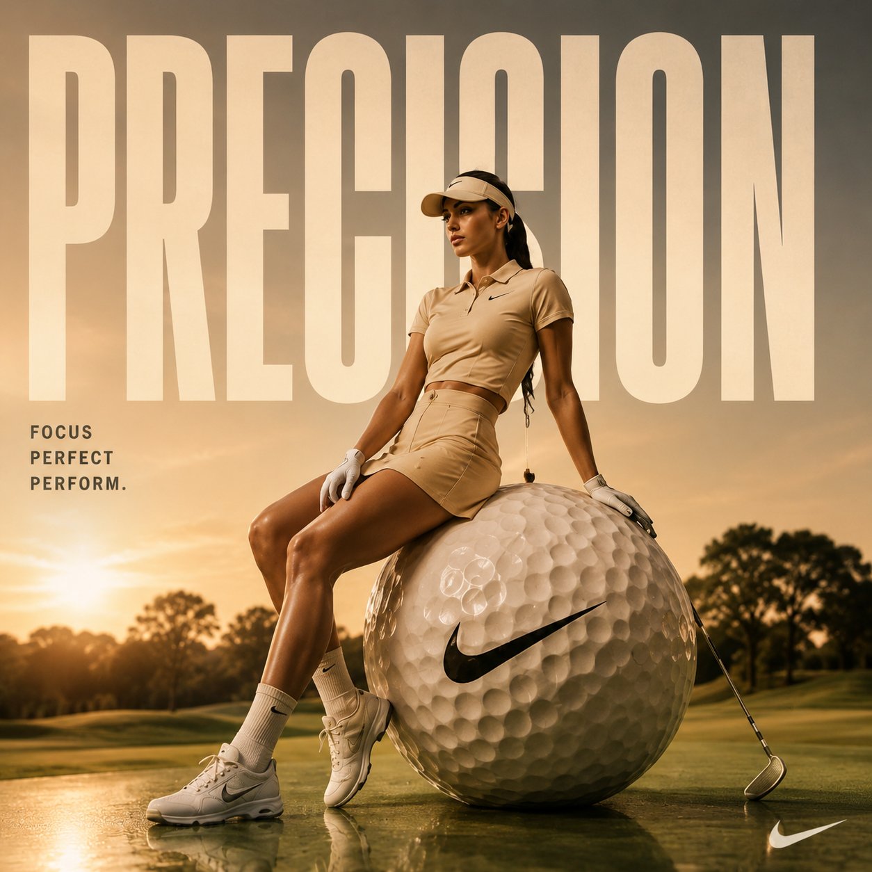
- Prompt: High-impact cinematic sports advertising poster featuring [athlete or product], strong rim light, bold color contrast, clear negative space for a later headline, dynamic movement, modern editorial layout, 9:16 vertical format, no generated text.
- Review: check whether the frame has one dominant subject, enough empty space, and a clean path for later typography.
- First fix: if the image feels busy, reduce props and background action before changing the model or style.
How to iterate inside Vogue AI
- Use GPT Image 2 when instruction following, product edits, and reference fidelity matter most.
- Use Nano Banana when you want fast variations or lightweight image-to-image exploration.
- Use Midjourney when fashion mood, editorial styling, or stylized concept exploration is the priority.
- Keep the same prompt skeleton when switching models so the comparison is meaningful.
- Save the version that solved the job with a plain label such as product-hero-graphite-4x5.
Failure diagnosis checklist
| Failure mode | Fix first | Avoid |
|---|---|---|
| Wrong subject or identity | Strengthen subject wording or add a reference handoff sentence. | Adding more style adjectives. |
| Generic visual style | Add audience, channel, material, lighting, and brand palette. | Rewriting the whole prompt before fixing the brief. |
| Messy composition | Specify crop, camera distance, negative space, background, and focal point. | Changing models before fixing layout. |
| Broken text or logo | Remove generated text and reserve a clean area for later typography. | Asking for final readable text inside the image. |
| Good result drifts after edits | Duplicate the working version and replace only one variable. | Stacking edits into an unstable prompt. |
FAQ
What is the most important prompt engineering tip?
Write the job and subject before the style. A prompt with clear subject, composition, and output rules is easier to improve than a beautiful but vague paragraph.
Do longer prompts always work better?
No. A longer prompt helps only when the details control a real failure mode. Add structure, reference rules, crop, and review criteria before adding decorative language.
When should I use a reference image?
Use a reference image when identity matters: face, product shape, packaging, UI layout, logo position, or color system. Say exactly what the reference should preserve.
How do I fix a bad first image?
Name the failure first. If the subject is wrong, fix subject or reference. If the frame is messy, fix crop and hierarchy. If the style is generic, add audience, material, palette, and lighting.
Should I ask AI to generate final text in the image?
Usually no. For final headlines, prices, legal copy, and logos, reserve clean space and add typography in a design tool after generation.
How do I reuse a good prompt?
Save the prompt that solved the job, name the variable fields, and duplicate it for the next asset. Reuse the structure, not every surface detail.