To create consistent AI images, treat every generation as part of a small production system: one reference anchor, one reusable prompt skeleton, one style sheet, and one revision rule. Consistency usually fails when you keep rewriting the prompt instead of protecting the variables that must stay fixed.
TL;DR: the repeatable workflow
- Use a reference image whenever identity, product shape, face, wardrobe, logo placement, or UI layout matters.
- Separate fixed controls from variables: identity, style, camera, palette, aspect ratio, background, and changeable scene detail.
- Generate a first image, diagnose the biggest drift, then revise only that control instead of rewriting the full prompt.
- Save the solved prompt as a named recipe, then duplicate it for the next image in the series.
- Inside Vogue AI, choose GPT Image 2 for controlled instruction following, Nano Banana for quick reference-led variations, and Midjourney for stylized mood exploration.
Who this is for
This workflow is for creators, marketers, founders, and designers who need a character, product, campaign, or visual style to survive across multiple images. It is not a guarantee of pixel-perfect continuity; it is a practical way to reduce drift while keeping enough flexibility to build a usable series.
Image plan for this guide
| Role | Source | Why it fits |
|---|---|---|
| Hero | GPT Image 2 storyboard workflow prompt-library image | A multi-frame lantern festival storyboard is the clearest visual metaphor for consistency across a series, so it belongs in frontmatter only. |
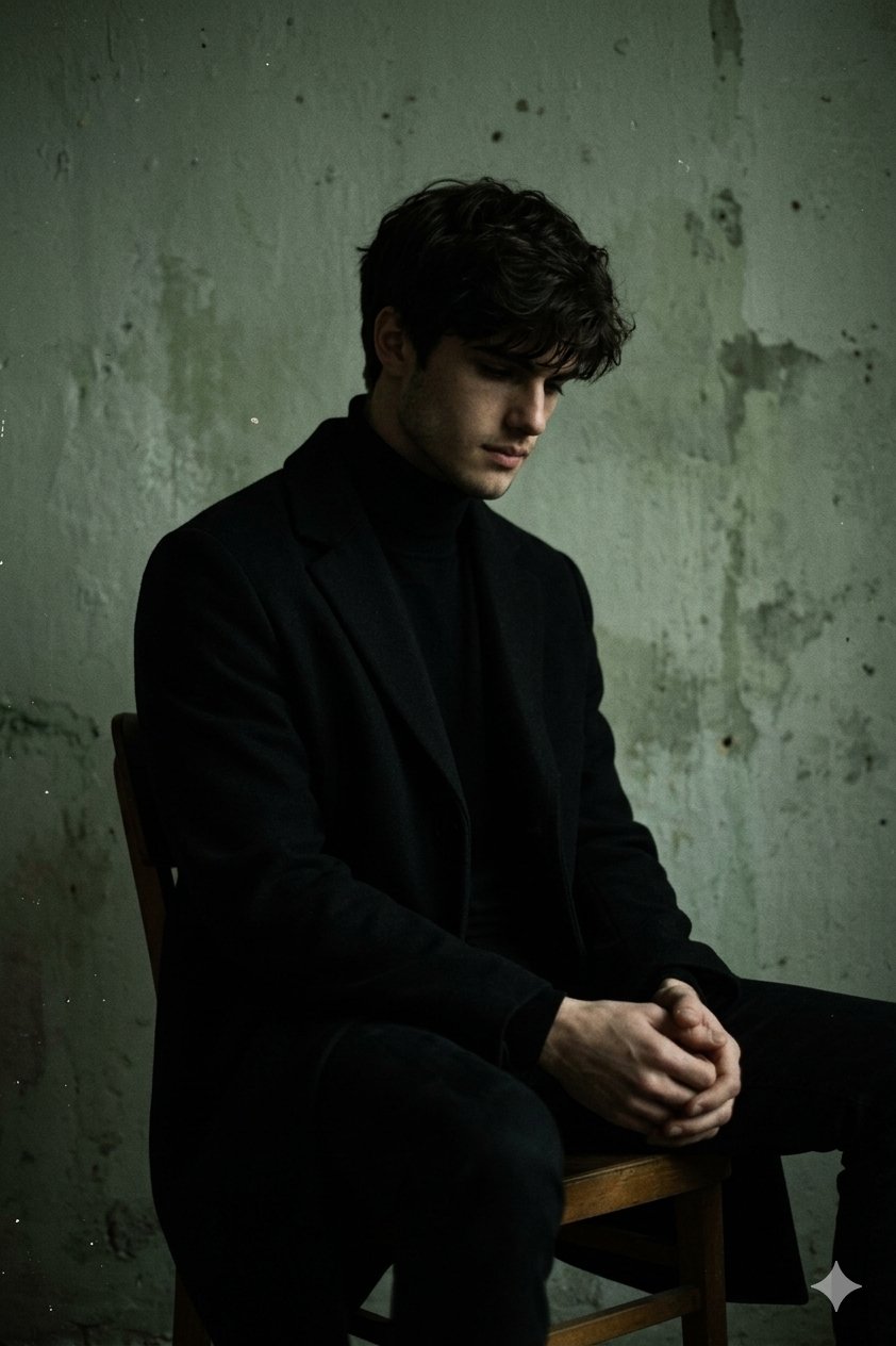
| Identity section | Nano Banana dark portrait example | A portrait reference is the right nearby image for character consistency and identity drift. |
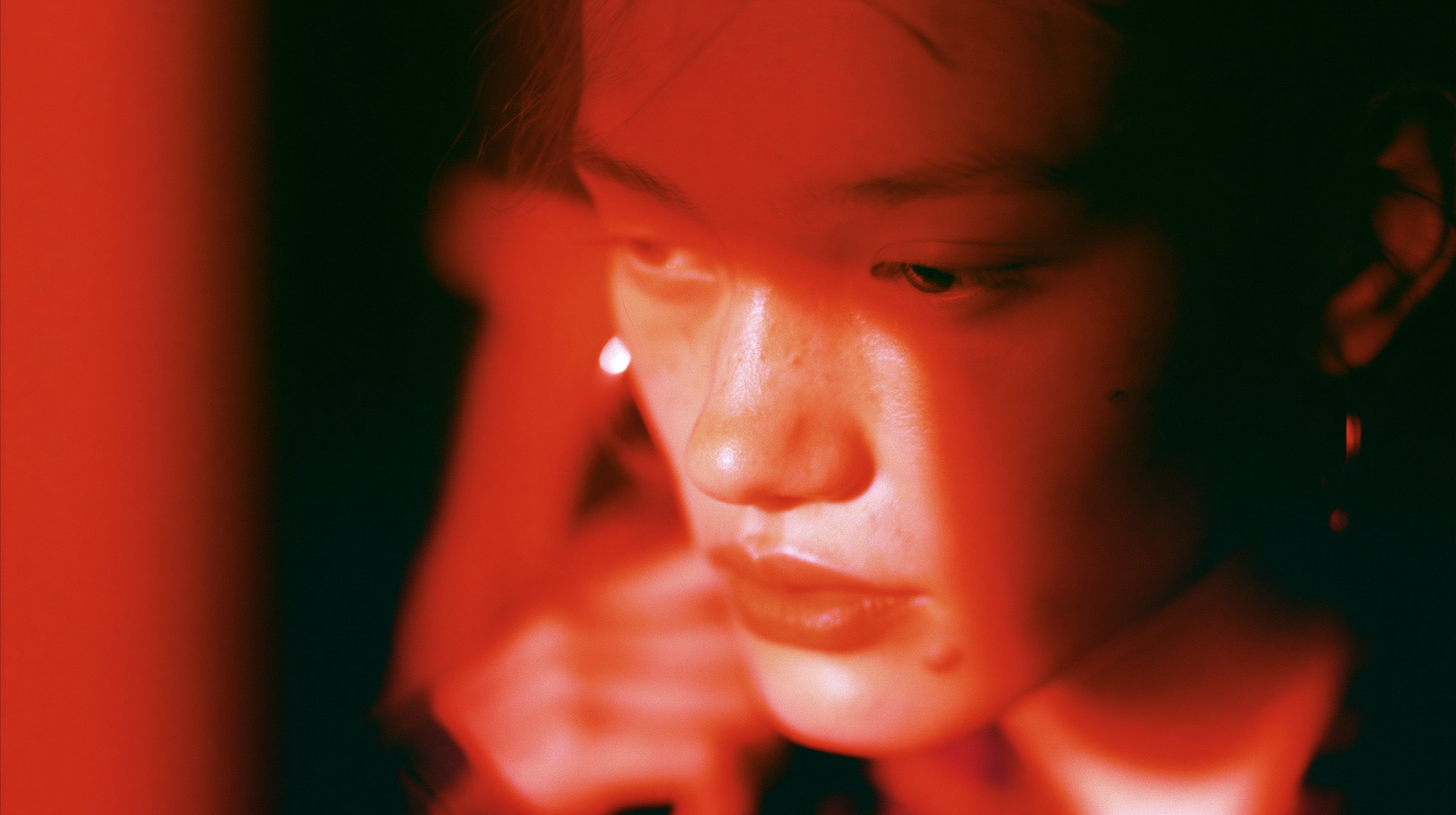
| Style section | Midjourney fashion editorial example | A fashion editorial frame shows how palette, lighting, lens, and mood can stay stable even when the subject changes. |
Consistency is four controls, not one magic prompt
| Control | What stays fixed | What can change | Common failure |
|---|---|---|---|
| Identity | Face, product shape, wardrobe anchor, brand marks, UI hierarchy. | Pose, scene, crop, expression, background. | The model invents a new person or redesigns the product. |
| Composition | Aspect ratio, camera distance, focal point, negative space. | Scene detail, props, channel format. | Every image feels like a different campaign. |
| Style | Palette, lighting, lens, texture, realism level. | Subject action, seasonal theme, environment. | The series jumps from cinematic to cartoon to studio photo. |
| Revision rule | The solved prompt skeleton and reference handoff. | One failure at a time. | Fixing one problem creates three new problems. |
Step 1: choose the anchor before writing the prompt
If the image must look like the same person, object, package, interface, or campaign, start with an anchor. In Vogue AI, that usually means uploading or selecting a reference image and writing exactly what the reference controls. Do not ask the model to infer which parts are sacred.
- For a character, anchor face shape, age range, hairstyle, body proportions, and one wardrobe signature.
- For a product, anchor silhouette, color, material, label placement, and scale.
- For a brand series, anchor palette, lighting, negative space, typography-safe area, and art direction.
- For a UI or app screen, anchor hierarchy, device framing, and which elements must remain recognizable.
Step 2: write a prompt skeleton with fixed and variable fields
A consistent prompt should be boring in the right places. Keep the identity, camera, palette, and output rules stable. Change only the scene variable, product context, pose, or channel requirement.
- Reference-led character: Use the uploaded reference as the identity anchor for [character]. Preserve face shape, hairstyle, age range, body proportions, and signature wardrobe color. Create a new [scene] with [lighting], [camera angle], and [aspect ratio]. Keep identity consistent, no extra people, no text, no watermark.
- Consistent product set: Use the uploaded product reference to preserve silhouette, material, color, label placement, and scale. Generate a [channel] image on a [background] with [lighting], [camera angle], and [composition]. Do not redesign the product, no fake logo text, no watermark.
- Series style system: Create image [number] in the same visual system as the previous frame: [palette], [lens], [lighting], [texture], [background language], and [render style]. Change only [variable]. Keep subject identity, framing rhythm, and atmosphere consistent.
- Revision prompt: Keep the previous image direction. Fix only [failure]: [specific correction]. Preserve subject identity, camera distance, palette, background, and aspect ratio. Do not introduce new props, people, logos, or text.
Step 3: build a style sheet for the series
A style sheet is a short list of repeatable visual decisions. It is more useful than a long paragraph because you can paste the same controls into every image and see what changed.
| Style sheet field | Example value | Why it matters |
|---|---|---|
| Palette | Black, bone white, muted gold, one red accent. | Prevents each image from inventing a new color system. |
| Lighting | Soft key light, deep side shadow, subtle rim light. | Keeps mood consistent across scenes. |
| Lens and crop | Portrait 85mm feel, chest-up crop, 3:4 ratio. | Makes the series feel like one shoot. |
| Background | Minimal studio wall, faint texture, no text. | Removes noisy one-off details. |
| Output rule | No watermark, no generated typography, preserve reference identity. | Protects production usability. |
Step 4: diagnose the first result before generating more
The first result is a diagnostic. If identity is wrong, strengthen the reference handoff. If the composition is messy, change crop and negative space. If the image feels off-brand, fix palette and lighting. Switching models or adding more adjectives too early hides the real problem.
Worked example: one character across three scenes
Raw job: create three images of the same young ceramic artist for a launch story: studio portrait, product-making moment, and outdoor market booth. The person must remain recognizable, but pose and environment can change.
- Anchor: one portrait reference controls face shape, hairstyle, age range, and warm earth-tone jacket.
- Style sheet: natural daylight, soft film contrast, shallow depth of field, warm clay and cream palette, 3:4 aspect ratio.
- Variable field: scene changes from studio portrait to hands shaping clay to market booth.
- Review rule: reject any image where face identity, jacket color, or palette drifts before judging artistic taste.
Prompt version 1
- Use the uploaded portrait as the identity anchor for a young ceramic artist. Preserve face shape, hairstyle, age range, and warm earth-tone jacket. Create a natural daylight studio portrait in a ceramics workspace, soft film contrast, shallow depth of field, clay and cream palette, 3:4 aspect ratio, no extra people, no text, no watermark.
Revision rule
If the face changes, do not change the scene yet. Add: the uploaded reference controls facial identity and hair; only the background and pose may change. If the identity is correct but the series looks disconnected, paste the same style sheet into every scene prompt.
Mistakes and fixes
| Problem | Fix first | Avoid |
|---|---|---|
| Same prompt creates different people | Use a reference anchor and name which identity traits must stay fixed. | Adding more personality adjectives. |
| Product keeps changing shape | State that the reference controls silhouette, material, label position, and scale. | Asking for a more premium style before fixing identity. |
| Style drifts across a series | Create a pasted style sheet for palette, lighting, lens, crop, and background. | Letting each prompt invent a new mood. |
| Generated text breaks the asset | Reserve blank space and add typography later outside the image. | Asking the model to spell final copy perfectly. |
| Good first image gets worse after revisions | Use a revision prompt that fixes one named failure only. | Stacking every new idea into the same prompt. |
Model choice inside Vogue AI
Use model choice as a workflow decision, not as a shortcut around clarity. GPT Image 2 is a strong first choice when the instructions are precise and the reference handoff matters. Nano Banana is useful for quick variations and social-first experiments. Midjourney is useful when the series depends on mood, fashion framing, or expressive style exploration.
Final checklist before you call the set consistent
- Can someone recognize the same character, product, or brand system without reading the prompt?
- Did the fixed controls stay fixed across at least three images?
- Did you save the prompt version that solved the problem?
- Are generated text, logos, hands, and product details acceptable for the actual channel?
- Can the next image be made by changing one variable instead of rewriting the prompt?
FAQ
Can I create consistent AI images for free?
You can practice the workflow with free or trial tools, but reliable consistency usually depends more on reference handling, saved prompts, and revision discipline than on price alone.
Do I need a reference image?
Use one whenever identity matters. If only mood or style matters, a written style sheet may be enough.
How do I keep the same character in different scenes?
Anchor the character with a reference, define stable identity traits, keep camera and palette consistent, and change only the scene variable.
Why does my product keep changing?
The prompt probably treats the product as an idea instead of a fixed object. Tell the model the reference controls silhouette, material, color, label placement, and scale.
Should I use the same seed?
A seed can help in tools that expose it, but it does not replace a reference anchor and stable prompt skeleton.
Can this workflow create consistent character video?
It can prepare stronger still-image references for video workflows, but video consistency adds motion, timing, and frame-to-frame constraints that need separate review.