Retro image prompts work when the era is specific enough to control color, texture, camera behavior, and layout. Instead of asking for a vague vintage look, describe the decade, medium, palette, surface wear, lens effect, and production job you want the image to perform.
TL;DR: make the decade do real work
- Pick one era first: 1960s print, 1970s poster, 1980s VHS, 1990s magazine flash, or early web nostalgia.
- Name the physical medium: risograph poster, faded paper ad, instant photo, VHS still, catalog scan, or brand board.
- Control color with a short palette instead of saying vintage, retro, or aesthetic repeatedly.
- Add one texture cue and one camera cue, then stop before the prompt becomes muddy.
- Use Vogue AI prompt-library examples as visual anchors when adapting the structure.
Image plan for this guide
| Role | Source | Why it matches |
|---|---|---|
| Hero | Nano Banana retro turtle illustration | It signals playful retro illustration without duplicating a body example. |
| VHS case | Midjourney glitch eyes image | It shows analog scanlines, glitch texture, and neon mood close to the 1980s prompt section. |
| Brand board case | GPT Image 2 Luna Coffee board | It grounds the brand-board prompt in a first-party layout with swatches, packaging, and vintage color. |
Retro prompt formula
| Part | What to write | Example |
|---|---|---|
| Era | One decade or design movement. | 1970s consumer poster. |
| Medium | The object the image should resemble. | Faded magazine ad, VHS still, catalog scan. |
| Palette | Three to five colors. | Burnt orange, teal, ivory, espresso. |
| Texture | Print, film, paper, or screen artifact. | Halftone dots, dust, grain, scanlines. |
| Job | How the image will be used. | Product hero, portrait, poster, mood board. |
Copyable retro image prompts
Copy one block, replace the bracketed variables, and keep the prompt in English for the first generation. The structure is deliberately plain so you can revise one control at a time.
- 1970s product poster: Create a retro product poster for [product], warm film grain, faded cream paper, hand-cut collage edges, bold geometric background, limited palette of burnt orange, teal, and ivory, centered product hero, soft halftone shadow, no readable text, 4:5 aspect ratio.
- 1980s VHS portrait: Editorial portrait of [subject], neon rim light, analog VHS scanlines, soft lens bloom, magenta and cyan color cast, black studio background, confident expression, sharp eyes, 3:4 crop, no extra hands, no text.
- 1990s magazine ad: Lifestyle campaign image for [brand or object], direct flash photography, glossy magazine texture, casual pose, playful props, saturated primary colors, visible paper grain, headline-safe empty space, 9:16 aspect ratio, keep all text areas blank.
- Retro brand board: Design a vintage brand mood board for [brand], arranged swatches, packaging studies, logo-free labels, aged paper, cream and espresso base with one accent color, tidy grid, realistic photographed board, 16:9 aspect ratio, no readable copy.
Case 1: 1980s VHS portrait and glitch texture
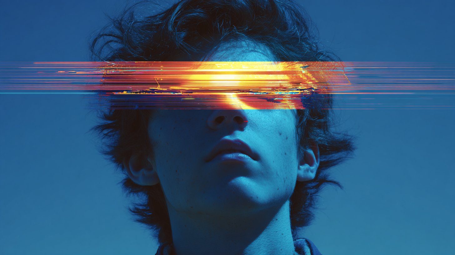
The common mistake with VHS prompts is overloading the image with neon words while forgetting camera and signal artifacts. Keep the subject simple, then add scanlines, chromatic bleed, timecode-safe empty space, and a clear crop.
Case 2: retro brand board with product discipline
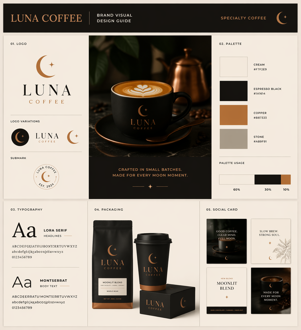
For product and brand work, the retro style should not hide the object. Use a board, catalog, or poster format when you need the model to preserve layout discipline and leave room for later typography.
Scenario matrix
| Use case | Best retro pattern | Reference image? | First failure to fix |
|---|---|---|---|
| Product poster | 1970s print poster with halftone texture and limited palette. | Use one when product shape or packaging matters. | Wrong silhouette or no headline-safe area. |
| Portrait | 1980s VHS still or 1990s flash magazine portrait. | Use one when identity, hairstyle, or outfit must stay recognizable. | Waxy face, extra hands, or texture covering the eyes. |
| Brand mood board | Vintage catalog board with swatches and packaging studies. | Useful for logo placement, palette, and package proportions. | Unreadable fake text or messy grid. |
| Social graphic | Retro collage or zine layout with empty text zones. | Optional unless brand palette must match. | Too much clutter for the channel crop. |
Worked example: turn a vague vintage request into a usable prompt
Raw request
Make a retro image for a cold brew coffee launch. It should feel nostalgic, but the can must still look premium and the frame needs room for a headline.
Prompt version 1
- 1970s premium cold brew poster, centered aluminum can on a faded cream paper backdrop, burnt orange and deep teal geometric sunburst, subtle halftone dots, soft catalog lighting, crisp condensation on the can, clean headline-safe space above, premium but nostalgic mood, 4:5 aspect ratio, no readable text, no watermark.
First-result diagnosis
If the can shape changes, add a reference image and say it controls silhouette, label position, and color. If the can is correct but the image feels generic, tighten the decade, medium, and palette before adding more adjectives.
Mistake and fix table
| Mistake | Fix first | Avoid |
|---|---|---|
| Vague vintage style | Name decade, medium, palette, and texture. | Stacking retro, nostalgic, aesthetic, old-school together. |
| Subject disappears under effects | Reduce texture strength and restate the subject as the hero. | Adding more film damage. |
| Fake unreadable text | Ask for blank label zones or headline-safe space. | Requesting final ad copy inside the image. |
| Wrong product or face identity | Add a reference image with explicit handoff rules. | Changing the whole style first. |
| Flat retro filter | Add a physical medium such as catalog scan or risograph poster. | Only changing color temperature. |
Use Vogue AI without overfitting the style
- Use GPT Image 2 when the prompt needs layout control, product discipline, or a brand-board structure.
- Use Nano Banana when you want quick playful variations or image-to-image retro treatments.
- Use Midjourney when the priority is mood-heavy editorial styling, VHS texture, or surreal nostalgia.
- Save the prompt that fixed the job, then duplicate it for the next product, portrait, or poster.
Era cheat sheet for stronger retro prompts
| Era | Best visual job | Controls to name | Avoid |
|---|---|---|---|
| 1960s print | Editorial poster, travel card, playful illustration. | Offset print, muted primaries, paper grain, simple shapes. | Mixing it with VHS, chrome, and 1990s flash in the same prompt. |
| 1970s poster | Product launch, music poster, warm campaign visual. | Burnt orange, teal, ivory, halftone, geometric layout. | Letting the product disappear behind grain and sunbursts. |
| 1980s VHS | Portrait, album art, glitch frame, night mood. | Scanlines, chromatic bleed, neon rim light, black background. | Covering the subject eyes with distortion. |
| 1990s magazine | Fashion, lifestyle ad, direct-flash portrait. | Glossy paper, direct flash, saturated colors, casual props. | Asking the model to spell final ad copy. |
| Early web nostalgia | Social graphic, icon collage, playful creator post. | Pixel edges, low-fi UI frame, sticker layout, empty text zones. | Overcrowding the crop until the subject has no focal point. |
Reference image handoff for retro work
A retro style can easily overpower the subject. When product shape, face identity, packaging color, or brand layout matters, use a reference image and explain the handoff instead of hoping the model preserves it automatically.
- Product reference: say the reference controls silhouette, label position, package color, and hero angle.
- Portrait reference: say the reference controls face identity, hairstyle, expression, and age while the decade treatment may change.
- Brand-board reference: say the reference controls palette family, grid discipline, package proportions, and blank label zones.
- After the first generation, inspect identity first, layout second, and texture third; retro surface treatment should never hide the commercial job.
FAQ
What is a retro image prompt?
It is a prompt that names an older visual system clearly enough for the model to reproduce its era, medium, palette, texture, camera behavior, and layout.
Should I write vintage or retro in every prompt?
Use those words once if helpful, then spend the rest of the prompt on concrete controls such as 1970s poster, halftone dots, faded paper, and limited palette.
Can retro prompts work for product images?
Yes, but product identity must stay above texture. Use a reference image when shape, packaging, label position, or logo placement matters.
Why do retro AI images become messy?
Most messy results combine too many eras, textures, and layout ideas. Choose one decade, one medium, one palette, and one production job.
Which model should I start with in Vogue AI?
Start from the risk: GPT Image 2 for controlled layout, Nano Banana for fast variations, and Midjourney for stylized mood exploration.
Can I ask the model to add retro text?
For final marketing copy, leave text areas blank and add typography later. Generated retro lettering may be useful as texture, but it should not carry the final message.